interior design: Estudio Muradas
ph: Daniela Mac Adden
digital retoucher: Silvia Cardozo
texts: Sol Dellepiane
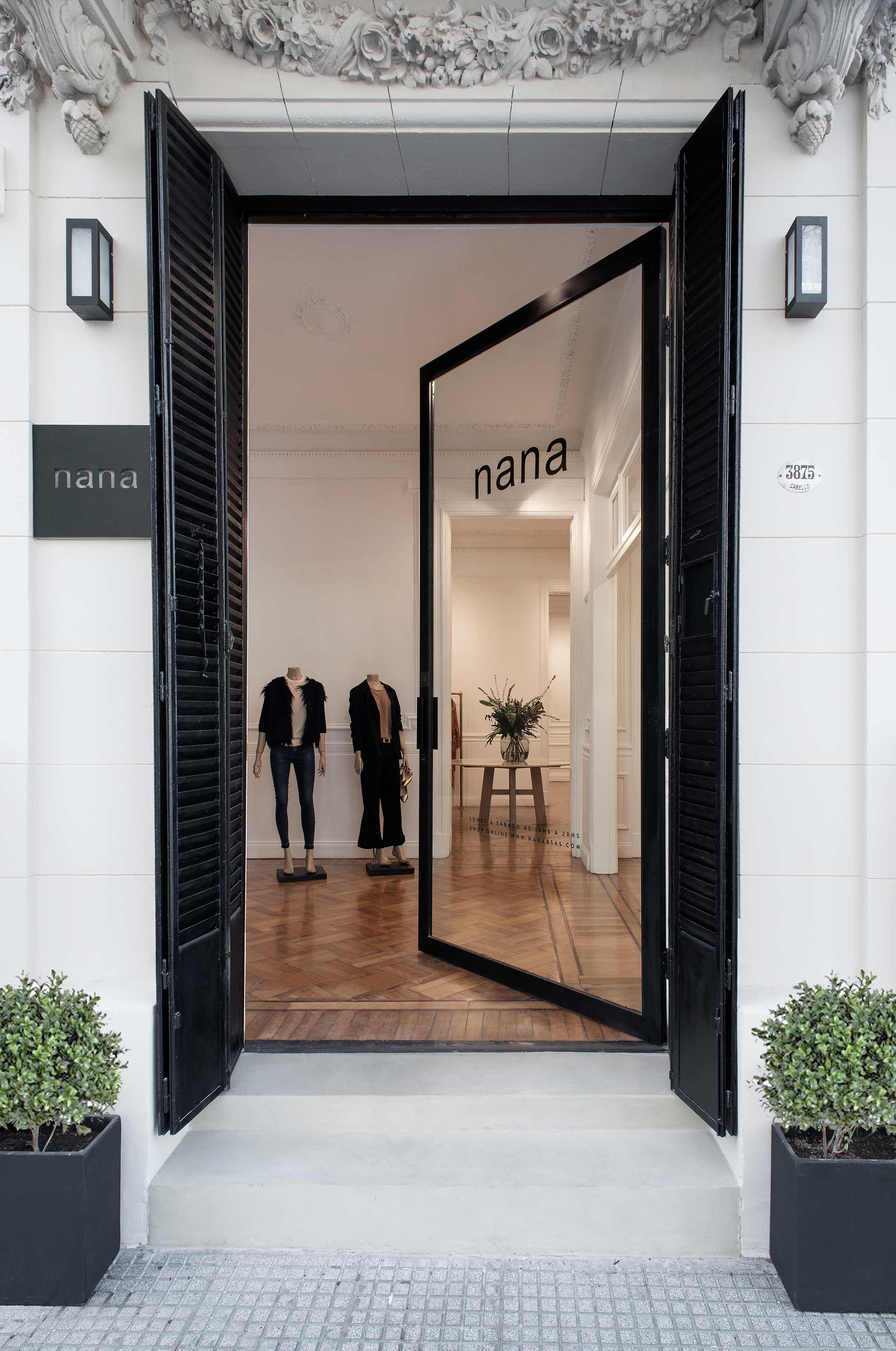
This ground–level store, located inside a charming old house in the Palermo neighborhood, was renewed. Becoming another success story, it definitely proves that there is a mutual agreement between Muradas Studio and Nana, the brand clothing line. Read more
Jorge Muradas is bonded to these clients both professionally and through friendship. He was in charge of designing their previous stores, a project for a house in the suburbs and a country home belonging to one of the founders of Nana. In terms of design, both teams uphold a shared vision which results in a match made in heaven.
A sober, elegant, aesthetic approach, marked by well-defined lines, a neutral-colored palette and top-notch quality, are trademark features found both in the Nana brand as well as in everything that has been transformed by the Muradas vision.
The clothing brand was in charge of creating uniforms for Muradas Studio representatives who cared for the display space during the prestigious Casa FOA exhibits. Nana made sure the clothing shown in the closets was true to the designer’s signature. The perfect team formed by Nana and the Studio is plain to see.
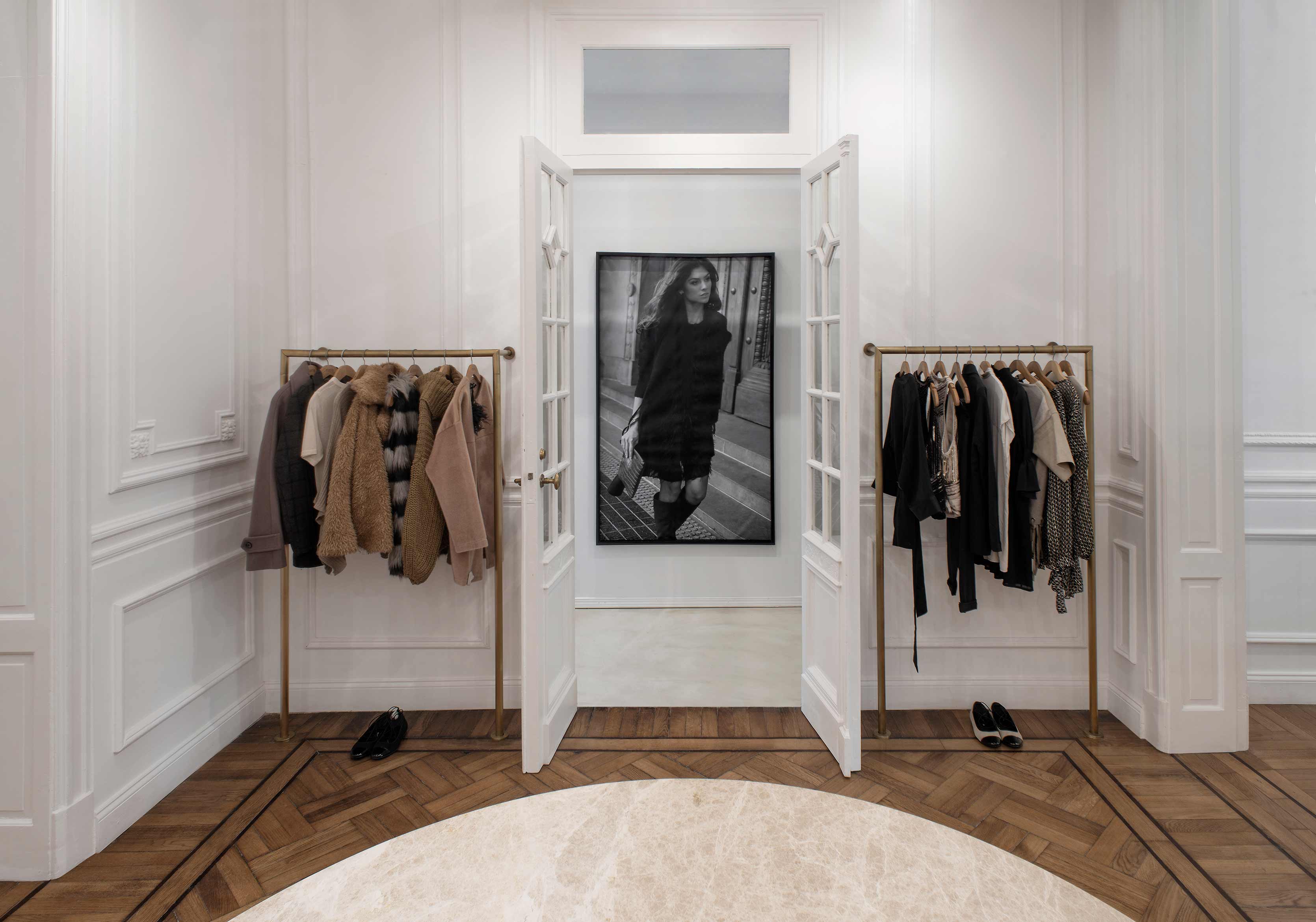
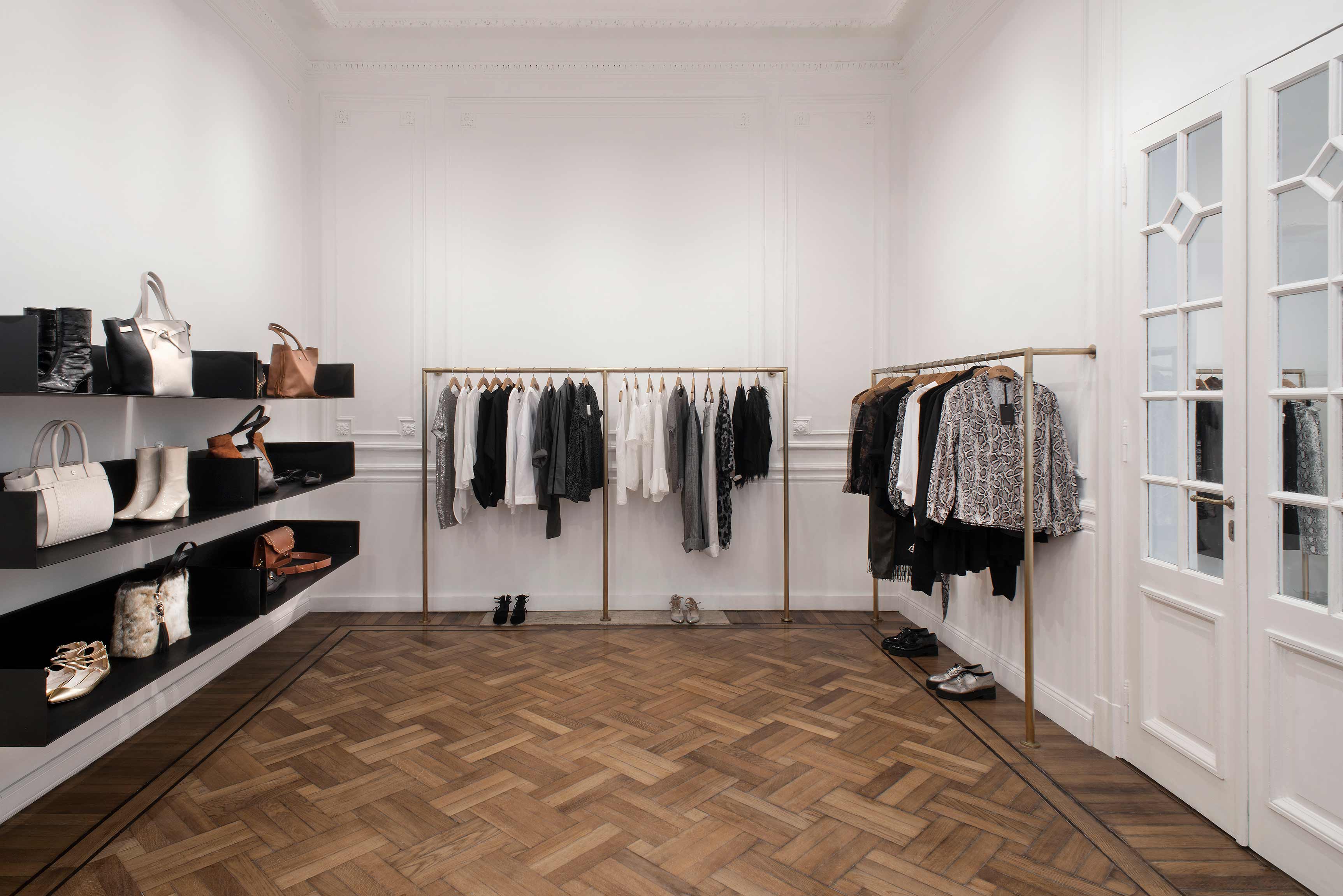
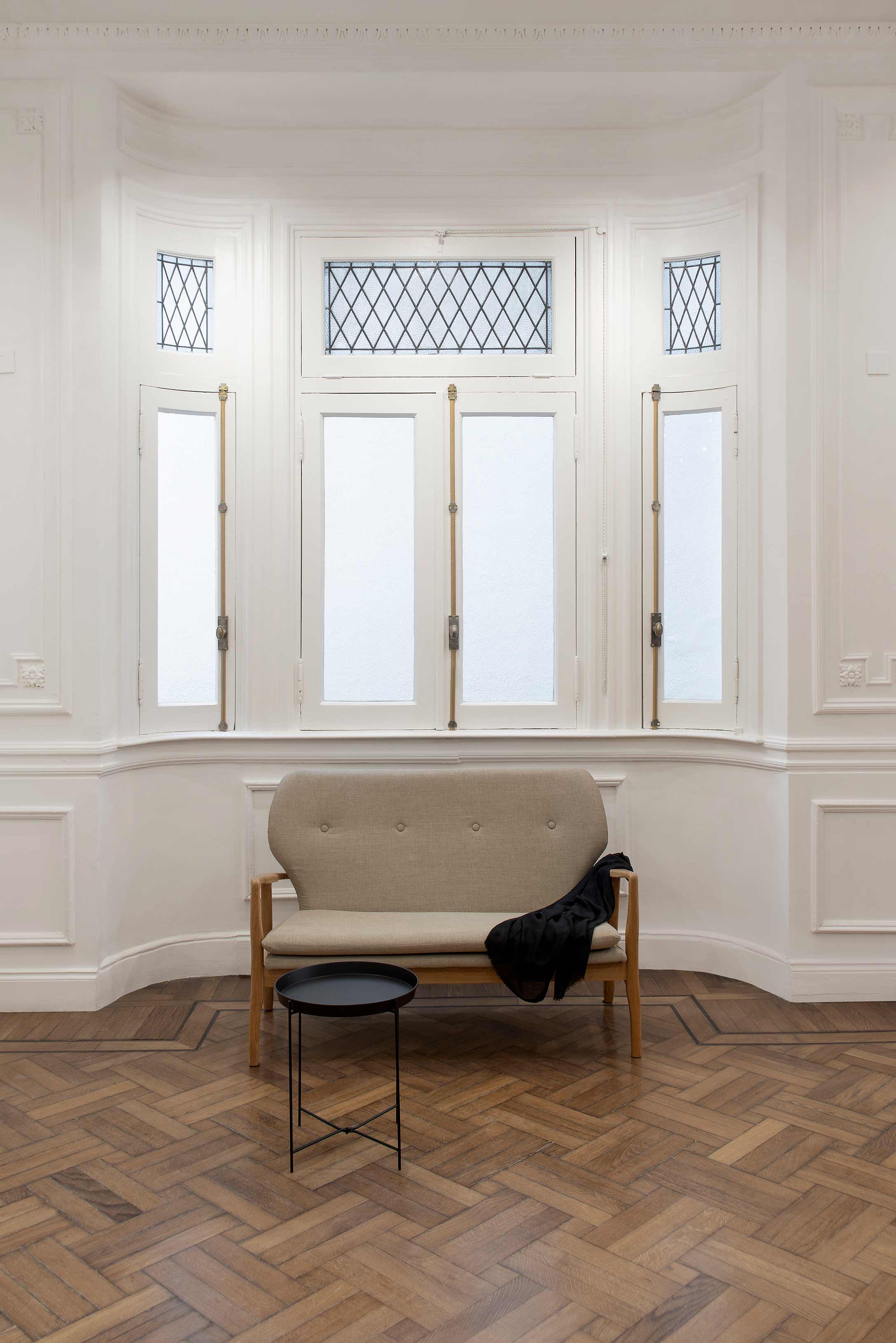
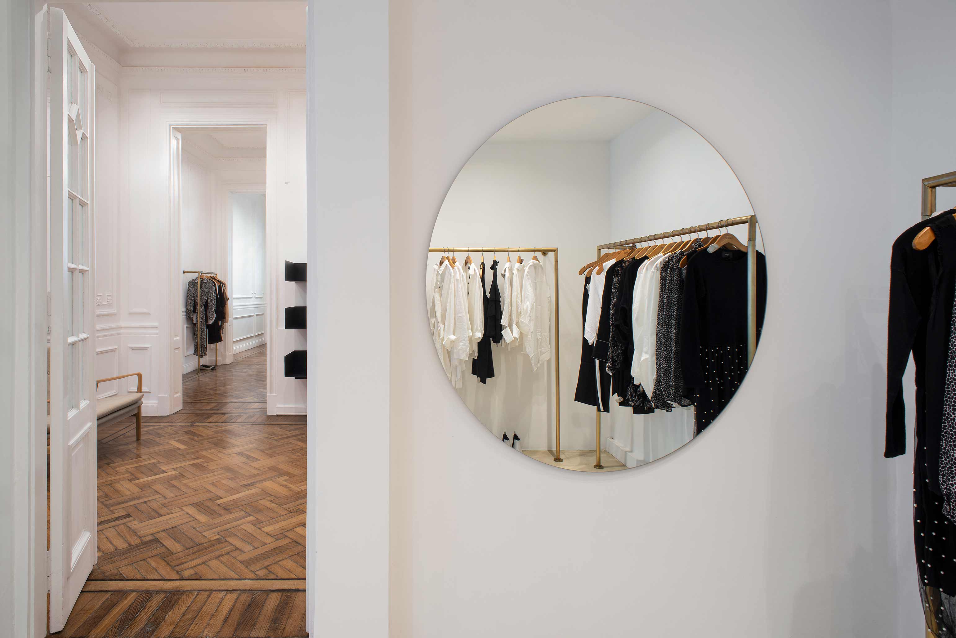
After these shared professional experiences, agreeing upon the strategies to transform the ground level of this antique house in the Palermo neighborhood ? located near the former zoo ? into the new Nana headquarters was not difficult. As is always the case when the Studio takes on projects involving French-style buildings, the goal was to preserve and enhance all classical elements while integrating them into a contemporary milieu. The ample layout was adapted to be functional as a store while merging the different spaces into the main display area.
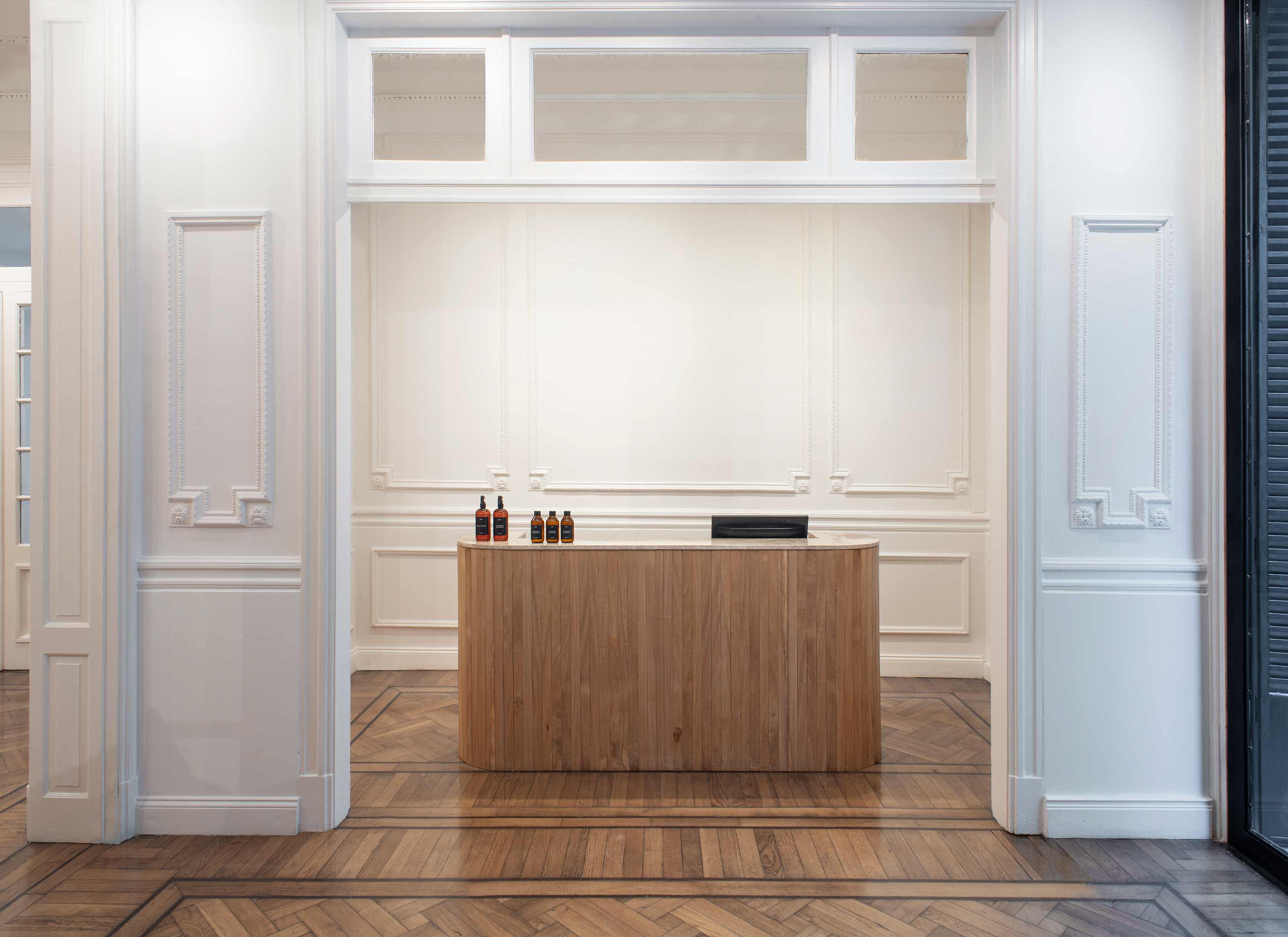
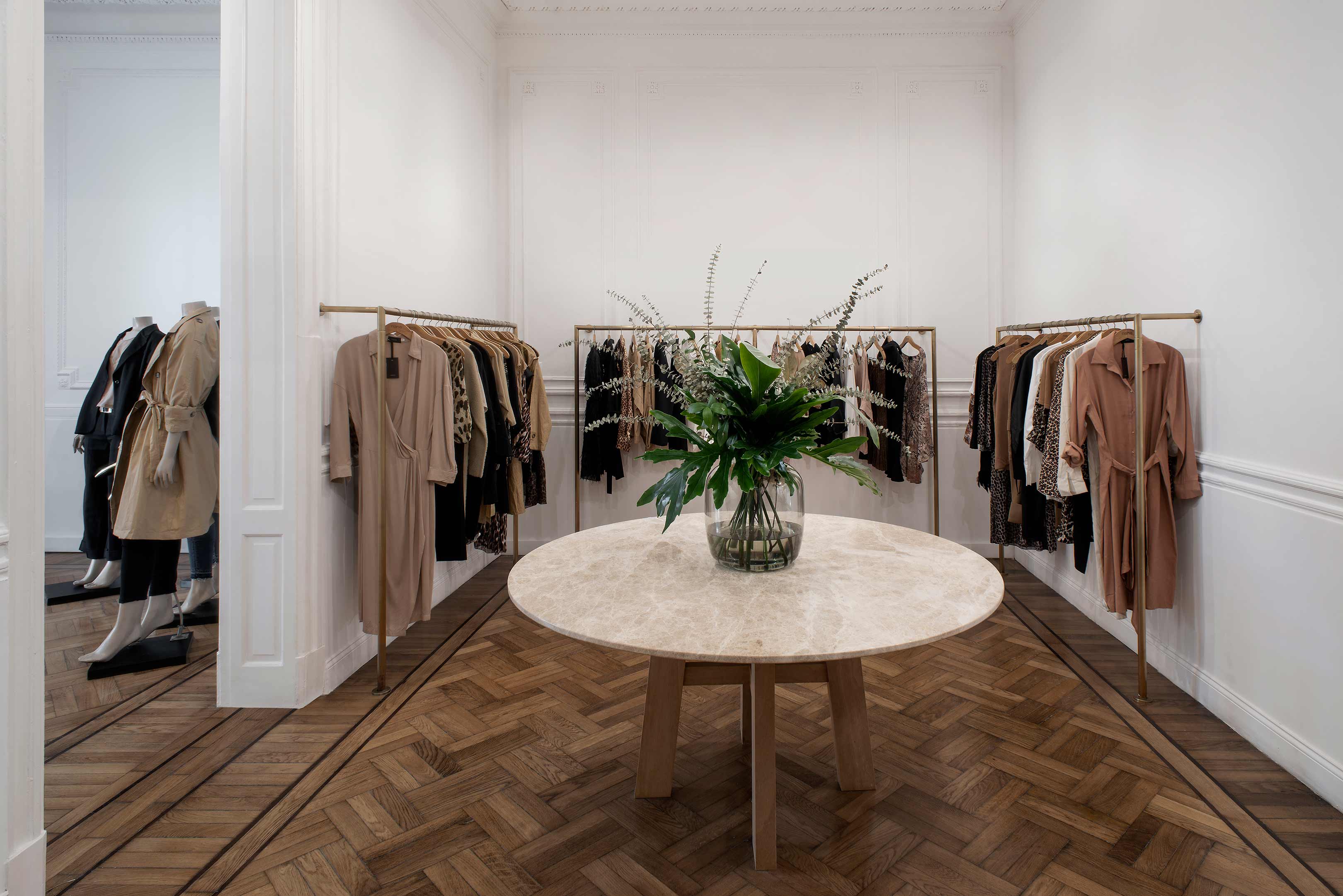
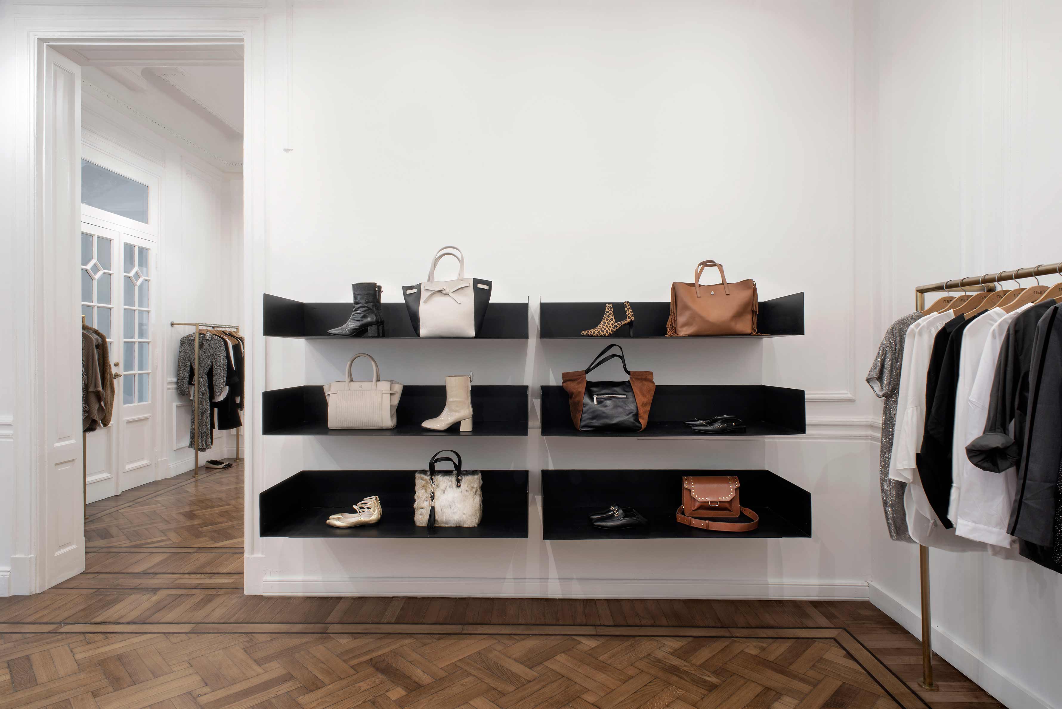
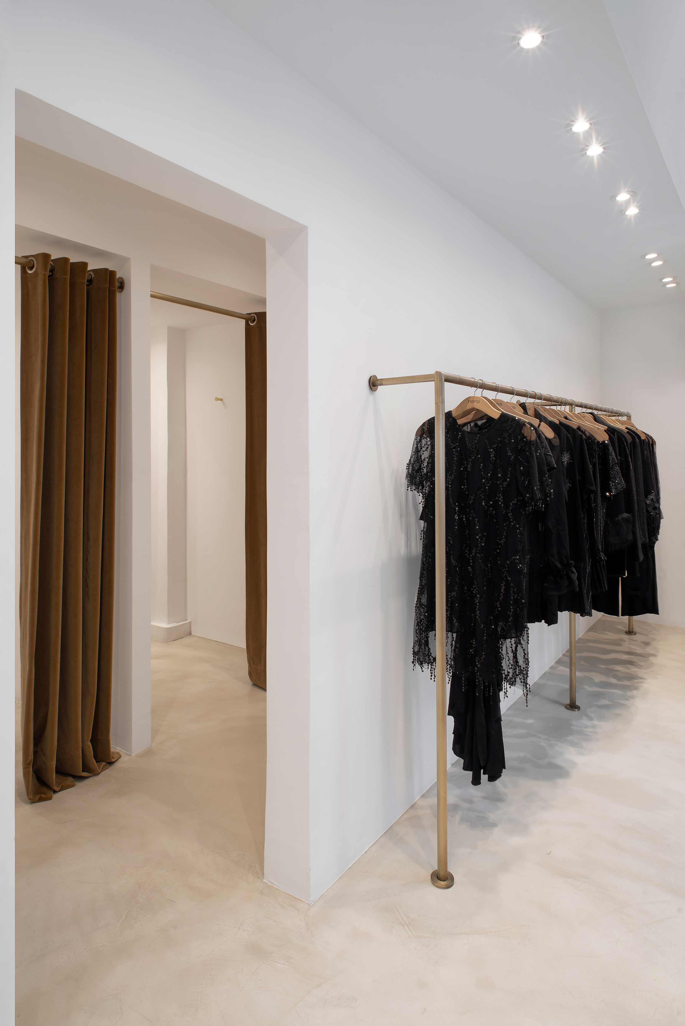
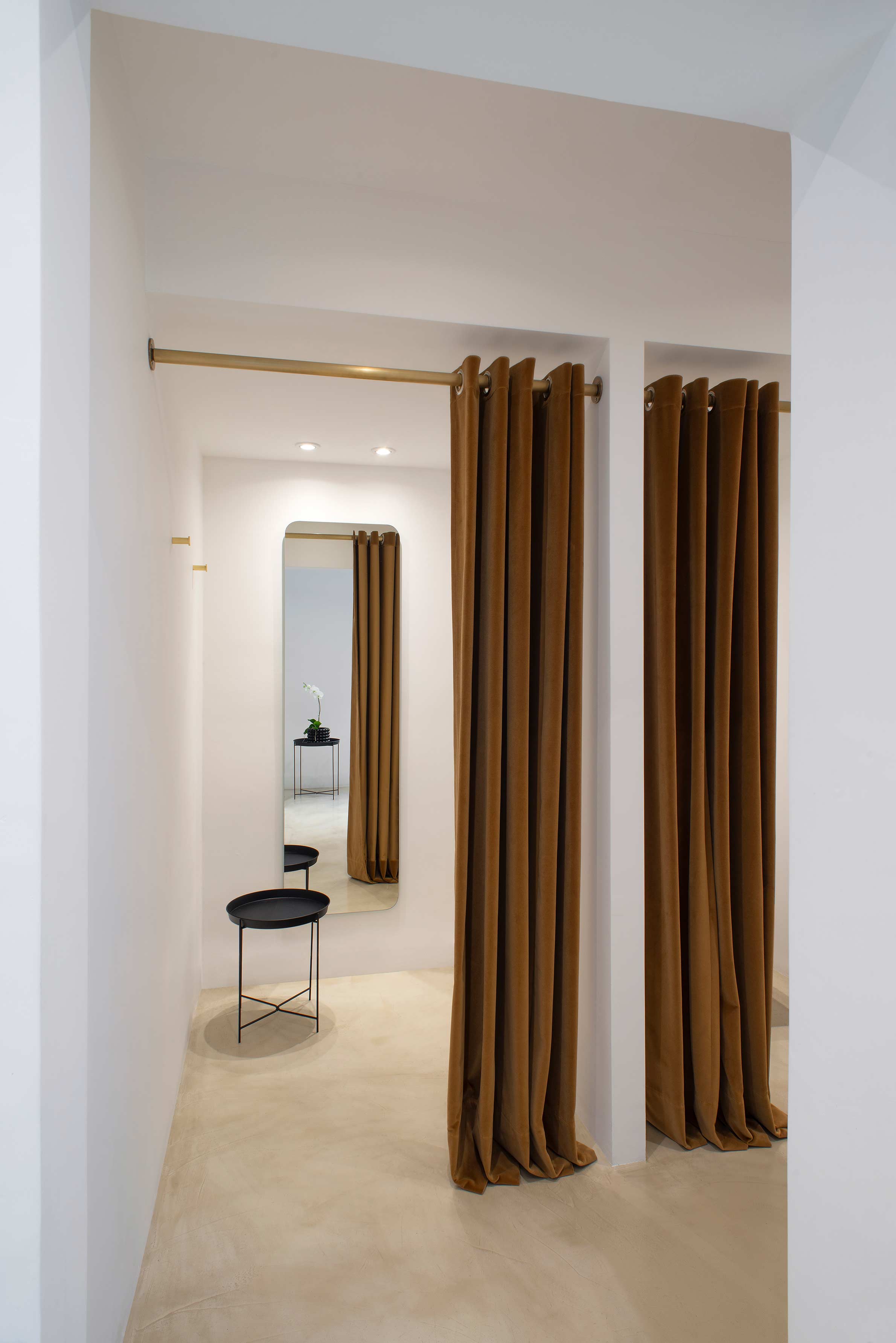
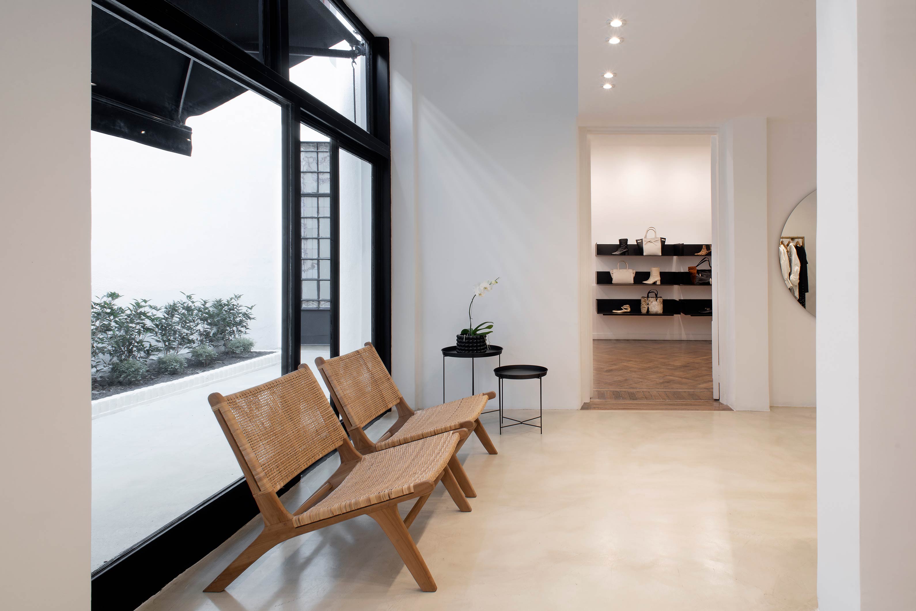
At the forefront, the sole window was converted into a shop display as well as becoming a front access door. The Slavonian oak floors were restored. An overall white paint treatment helped to unify the main space, including the molding and all wood carpentry. The monochrome setting is barely interrupted by several touches of black on the shelves ? located on chosen focal points ? and on the metallic carpentry. Also departing from white is the color of oak, which matches the bronze found in clothing racks and same-colored curtains used in the dressing rooms. White, black and subtle differences in bronze tones are in perfect harmony with the color scheme of the brand.
Located in the middle of the block, the store leads into a courtyard that was also given a minimalist treatment: a micro-cement floor in a neutral sand tone, contrasting with carpentry and an awning in black. The courtyard includes plants and is a wonderful asset, serving as a source of natural night for the whole store.
A rectangular module - with small wooden boards on the front- was designed for the customer area, with a marble countertop and rounded-off, circular corners. A table with the same marble top can be found at the center of one of the spaces. A couch with a retro design, coupled with a pair of Acento seagrass sofas, placed underneath a series of suspended lights, complete the feel of the general environment. Overall, the result is a very refined context which serves the purpose of highlighting the store’s unique brand.


