interior design: Estudio Muradas
ph: Daniela Mac Adden
digital retoucher: Silvia Cardozo
texts: Sol Dellepiane
An integral reform of a house built in the early XXth century, renewed its legendary past while at the same time incorporating the best the present has to offer, both in functionality and beauty. Read more
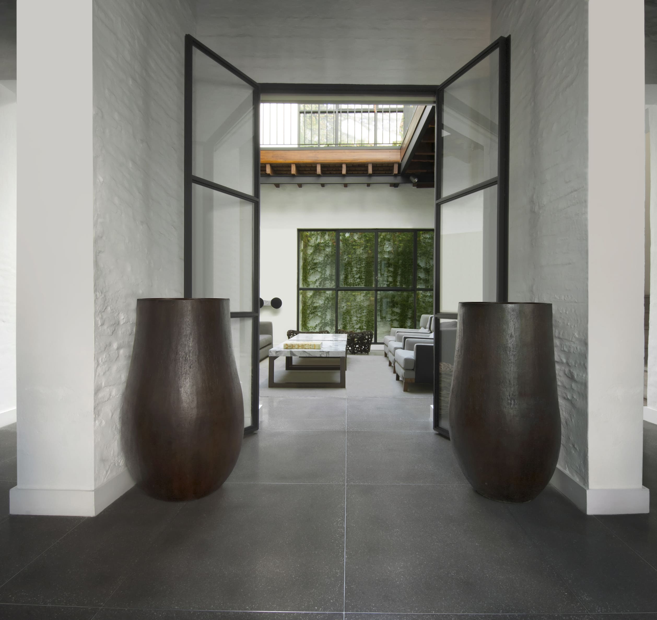
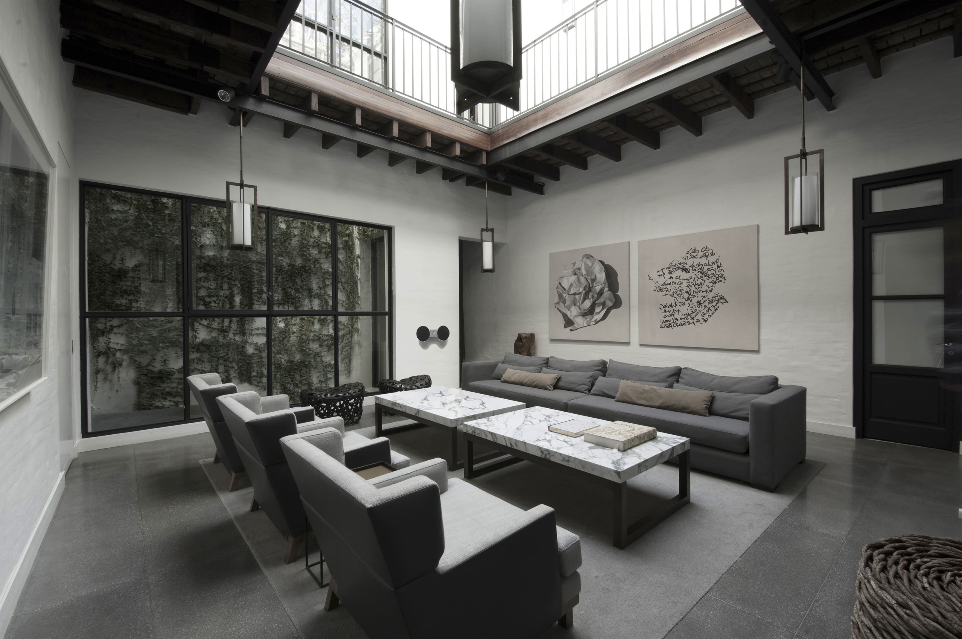
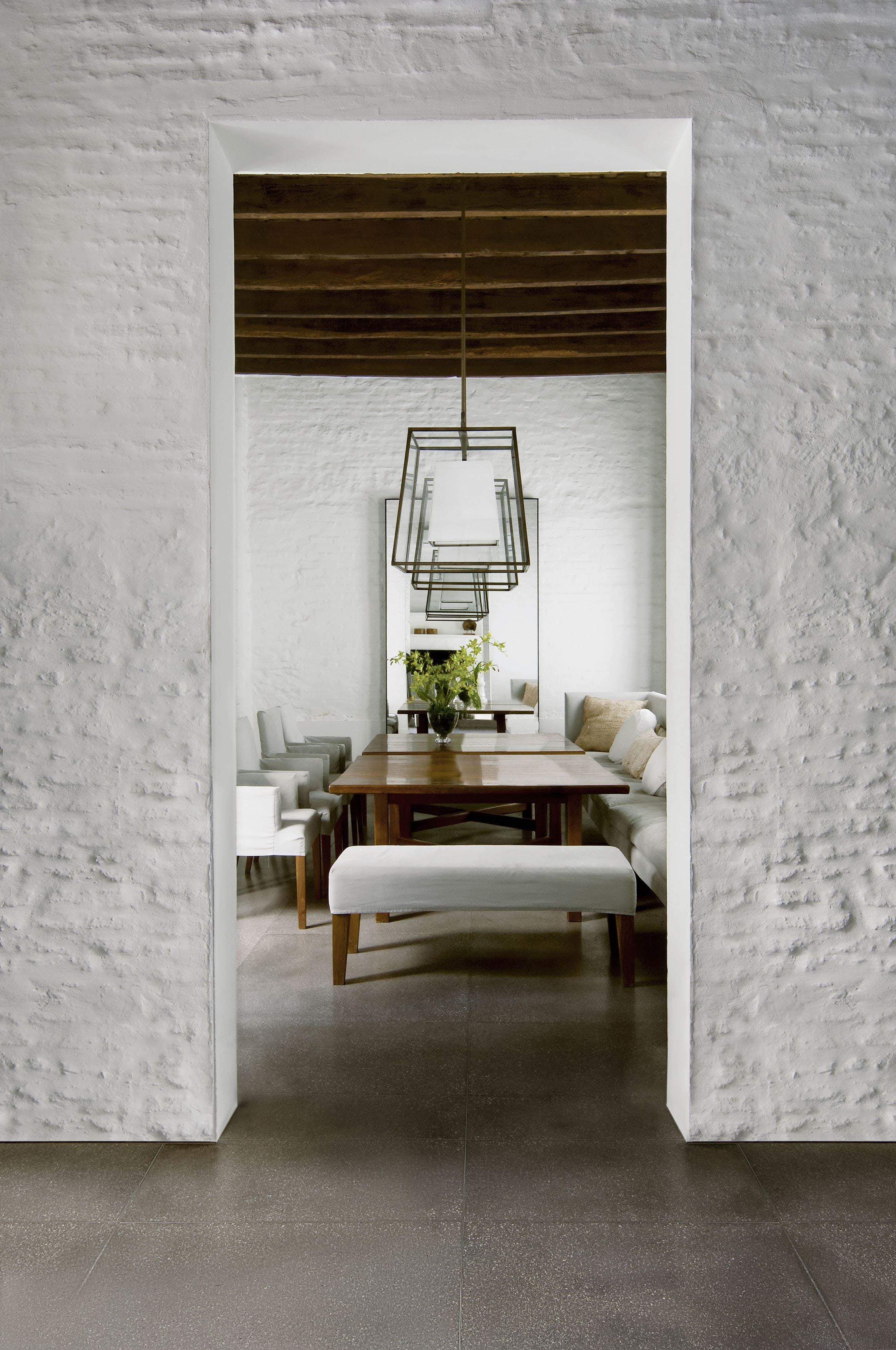
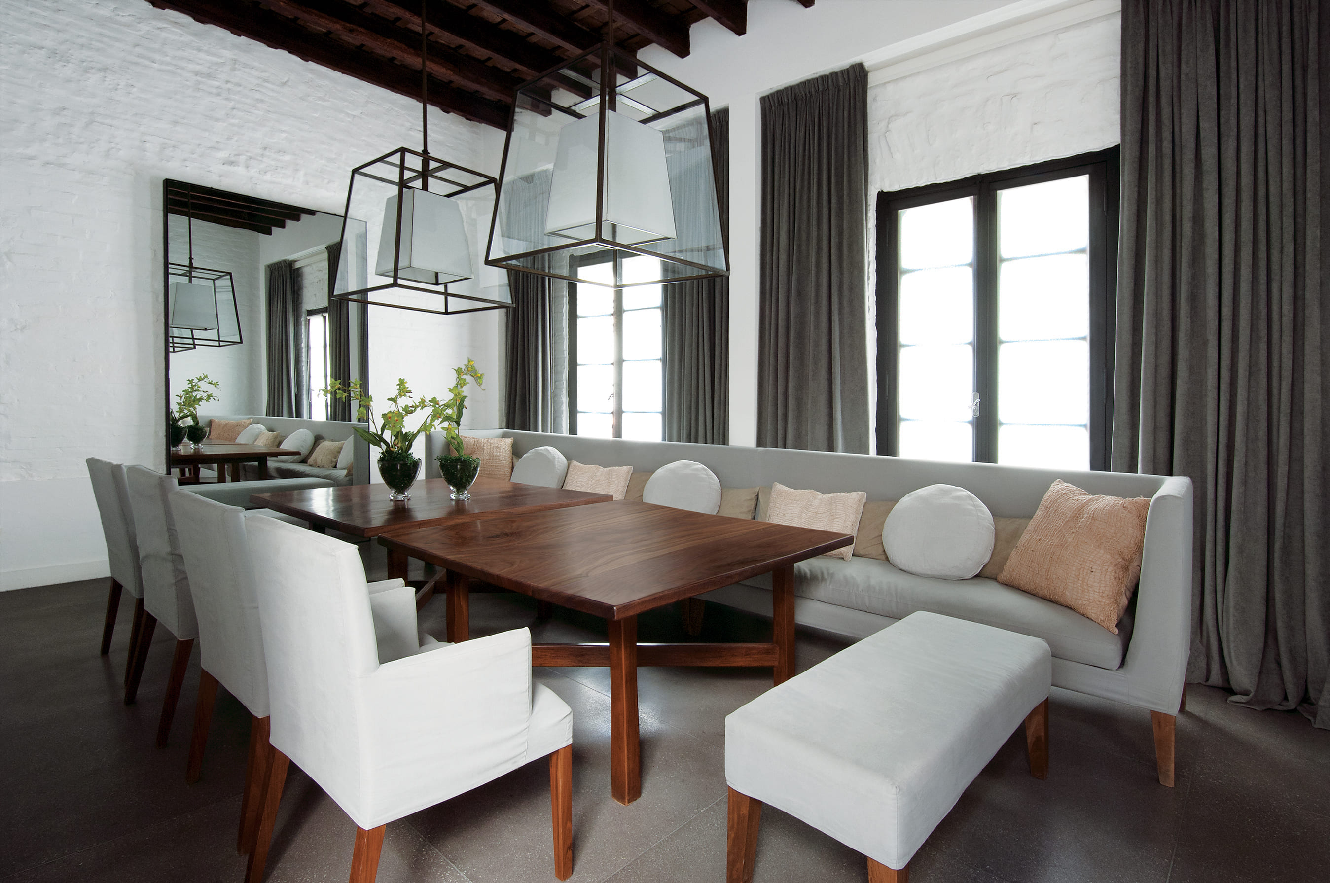
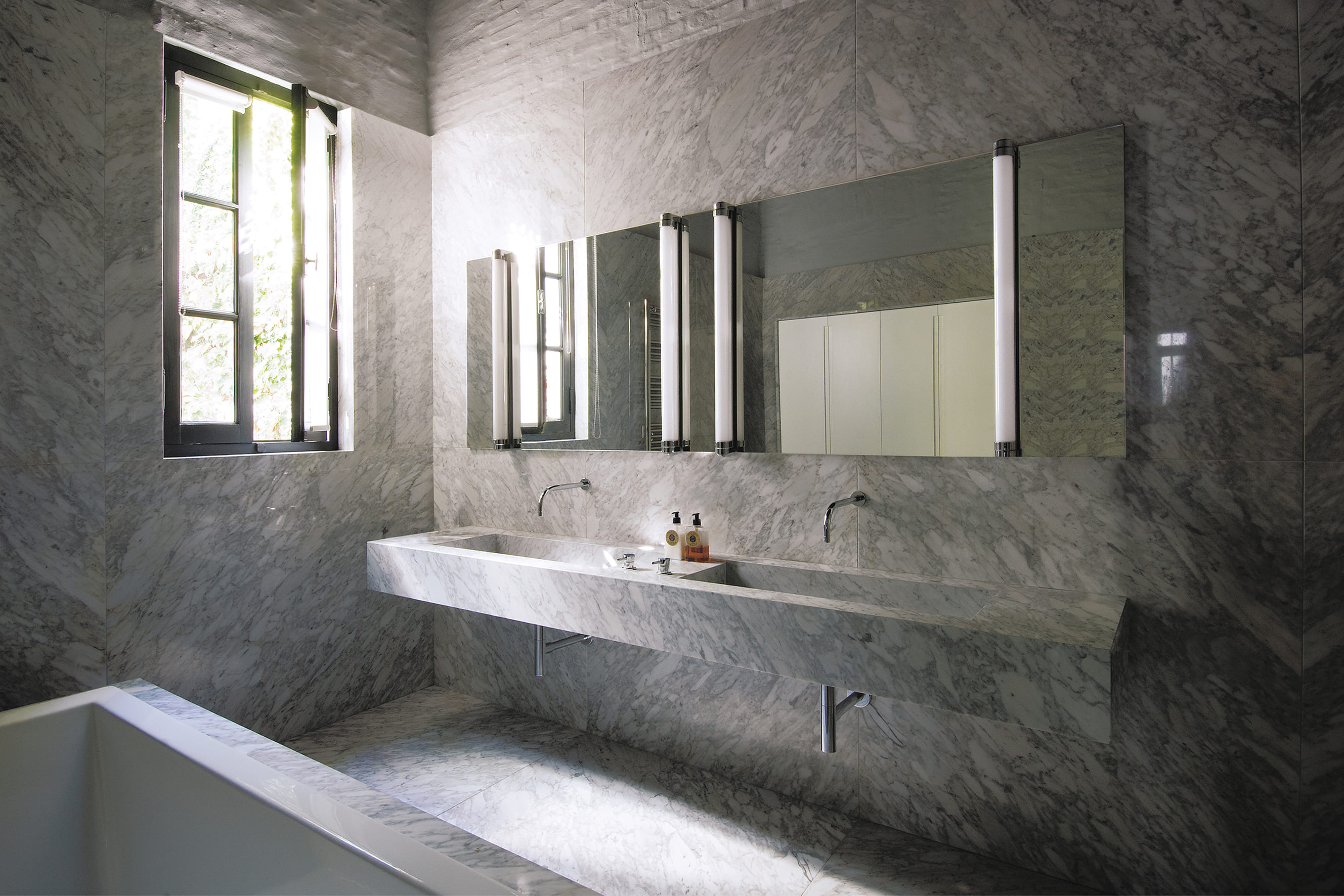
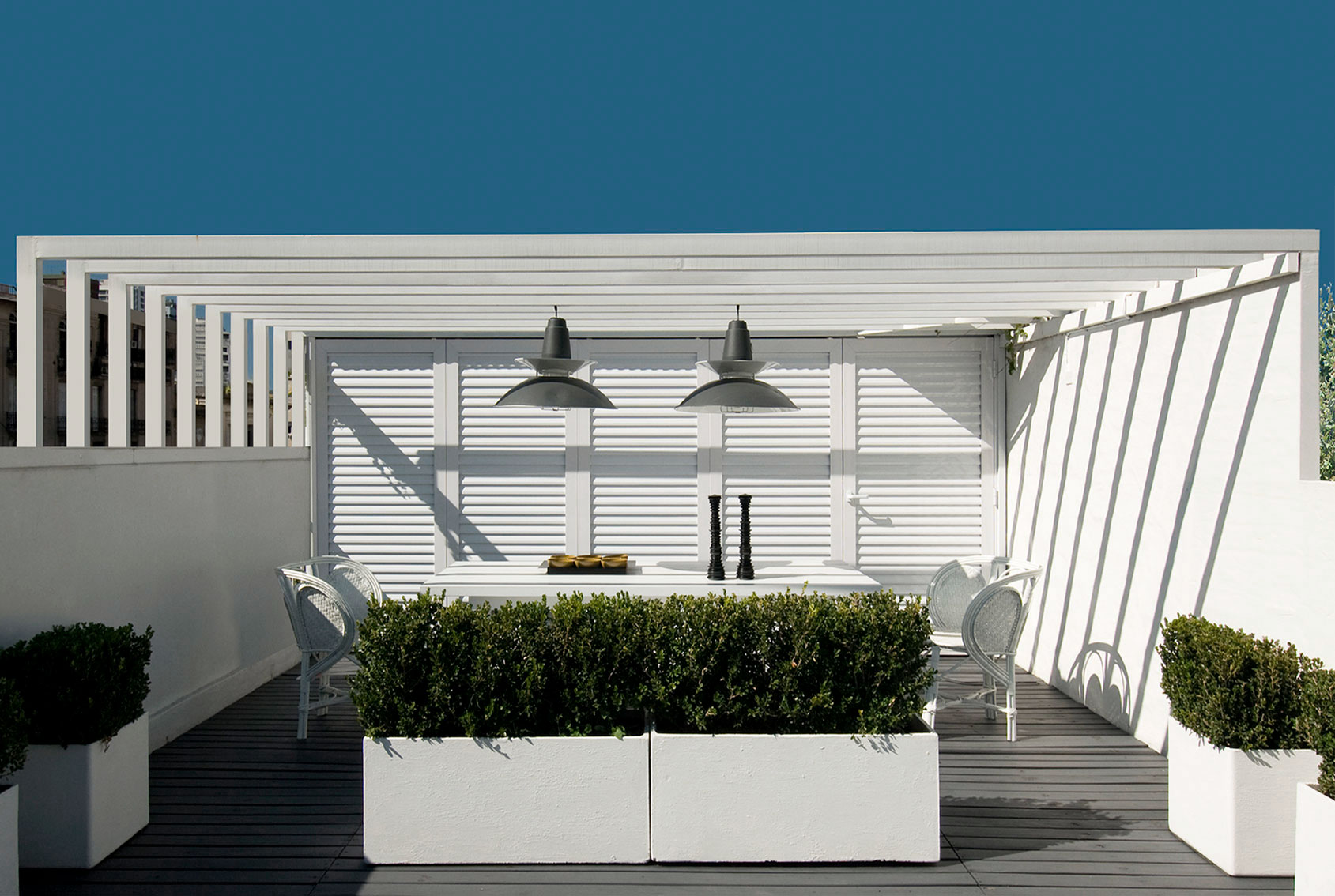
This house is located on a classic site in the Buenos Aires Historic District with a cloister layout on a square lot measuring 15 x 15 meters. Years earlier, the unit had been redone to improve quality. However, after living here for a decade, the owners realized they wanted certain functional changes, in terms of esthetics and technology, which would upgrade the property to offer them a life style that was more in sync with their needs. The reconditioning efforts flowed in perfect harmony with the clients - a prestigious advertising executive, his wife and their three children - who were enthusiastic about living with contemporary advantages while still conserving the magical air of history. One of the pillars of this project was generating the utmost integration with the central courtyard, the soul of the house, by turning this new design into an expansive living room. Large iron and glass windows were designed, the one on the top floor reaches up towards a dome that bathes every room in natural light. A playful conversation between different historic eras became the leitmotif of this renovation, the box was not covered, and the exposed bricks were painted white. In opposition, the iron components – the windows, the gallery cantilever gate and the original wooden doors – were painted black. The roofs made out of pinotea wood beams, and the exposed bricks without coverings, remain as a testimony to the past. While the wooden floors on the upper story were whitened, floors on the ground level were built in situ in granite colored cement. To complement all these choices, which prove that harmony among contrasting elements is possible when compatible lines are drawn, a detailed interior design effort ensued, incorporating modernly designed furniture, within a serene color palette, where white and gray are predominant in the equipment and where certain nods to times gone by can be found, adding a touch of warmth. The top level features a terrace with a pool. Once again, aiming for integration, the deck was painted black like the nearby urban attics. The counterpoint between black and white, added to the green in the vegetation, achieve a pleasant atmosphere of calm in a downtown area of the city.


