interior design: Acento Muradas
ph: Daniela Mac Adden
digital retoucher: Silvia Cardozo
texts: Sol Dellepiane
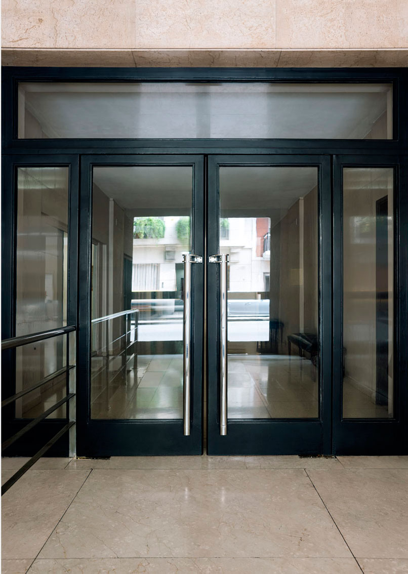
This renovation took place in an apartment located in a rationalist architecture styled building in Retiro, a porteñan neighborhood. It is a true reflection of its owner. Read more
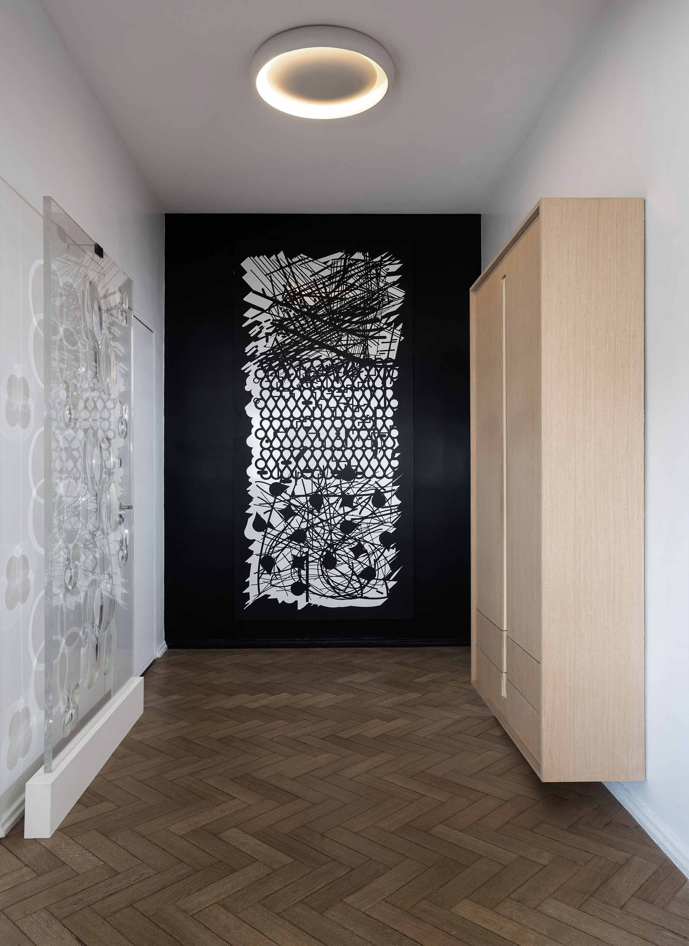
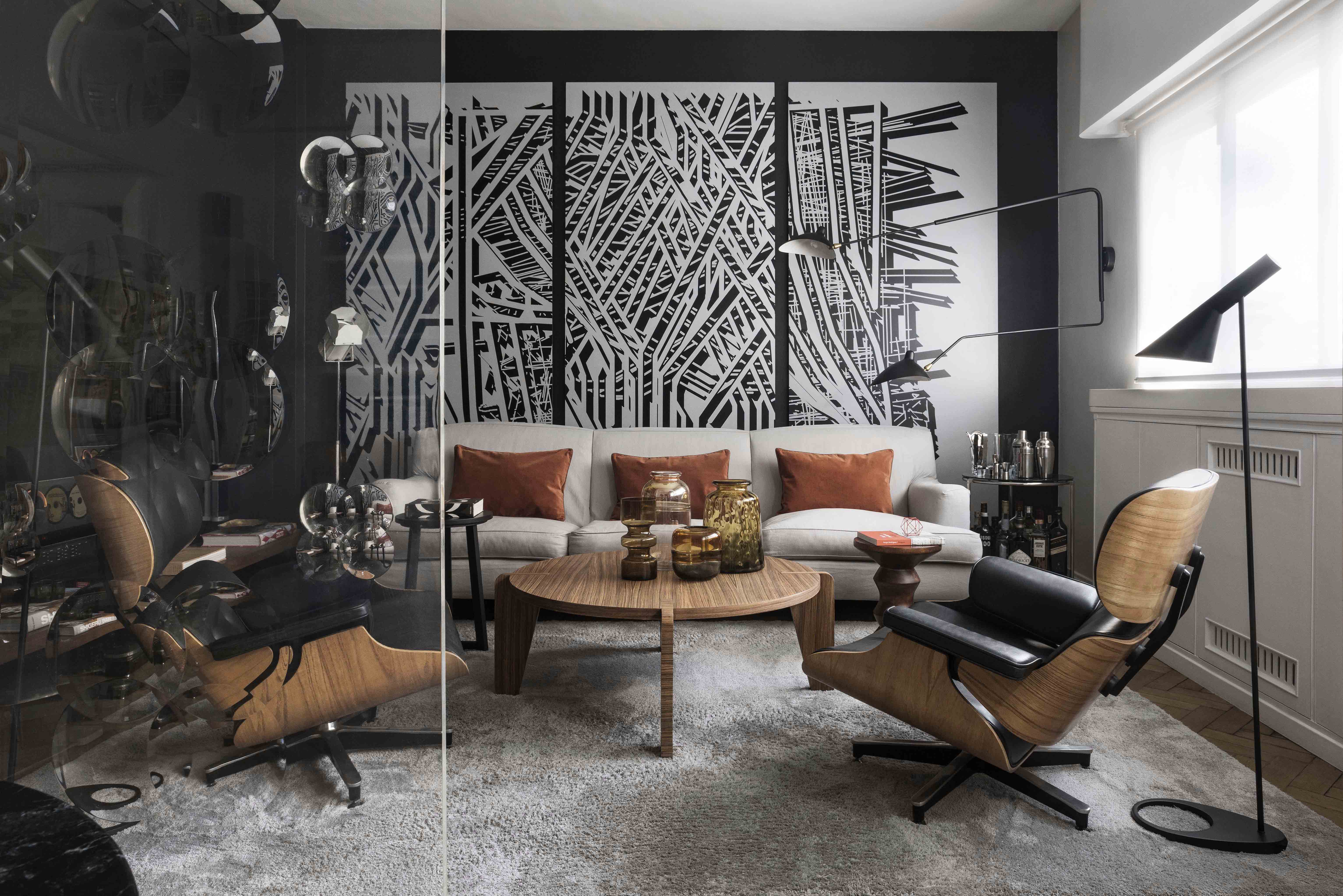
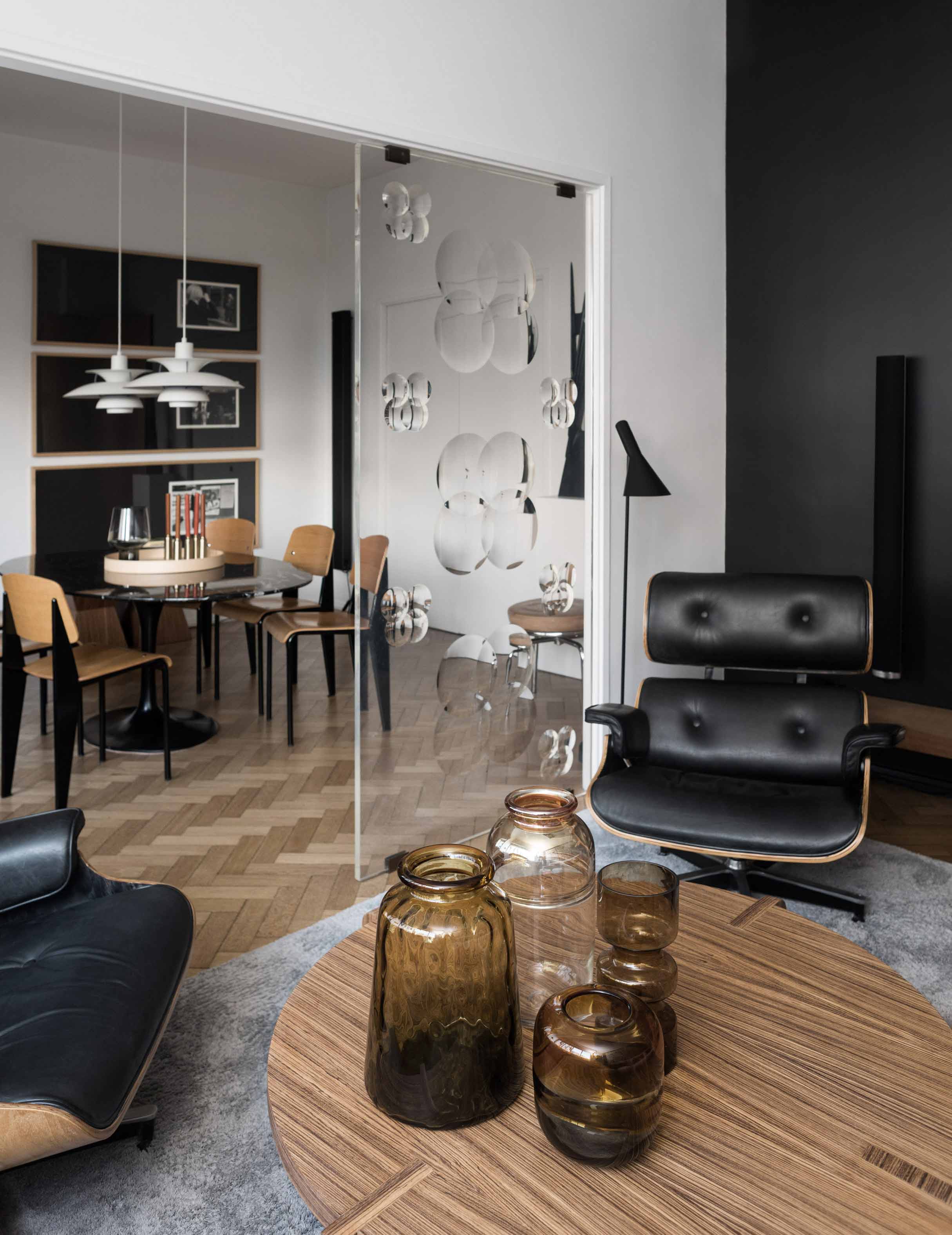
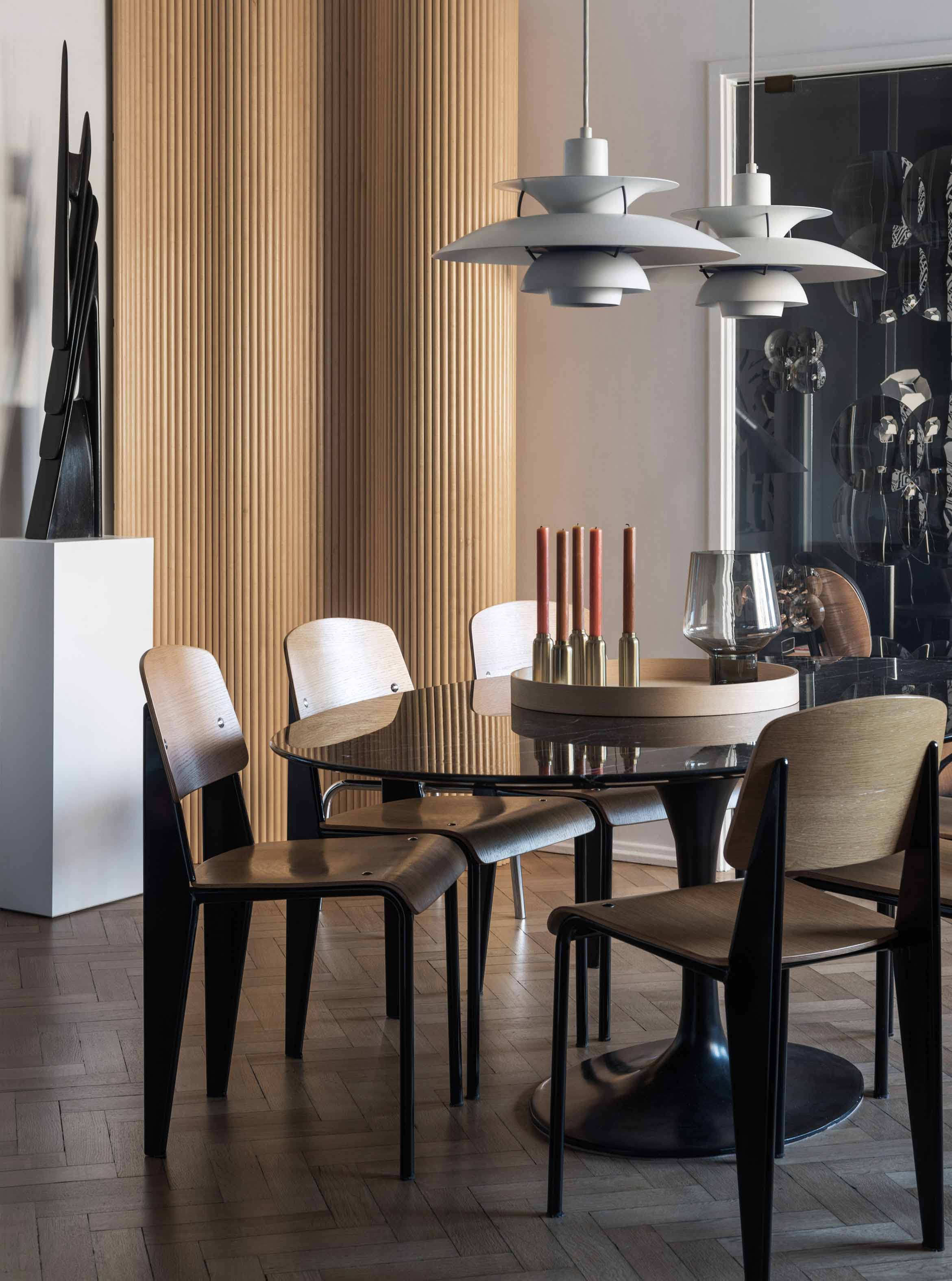
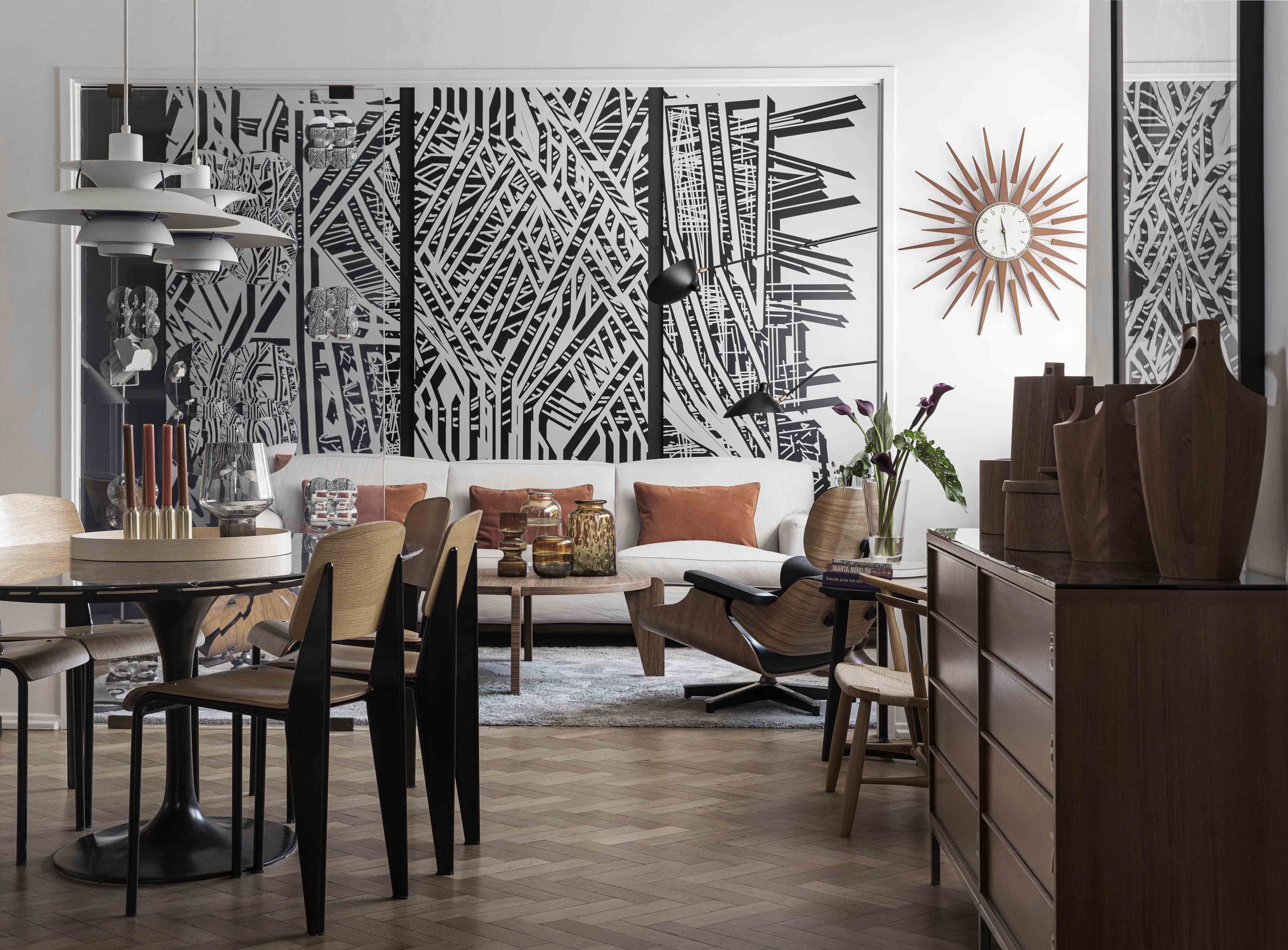
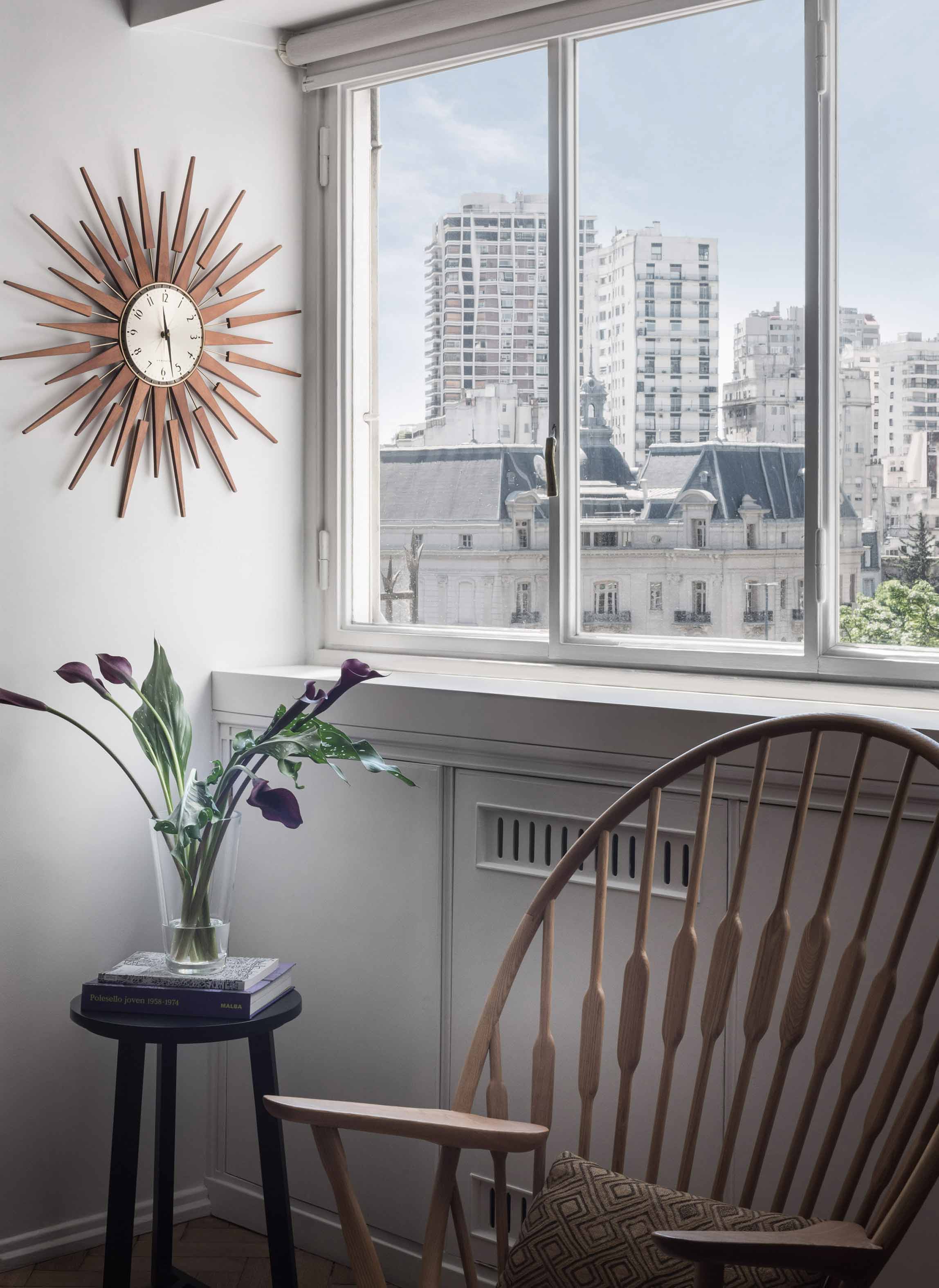
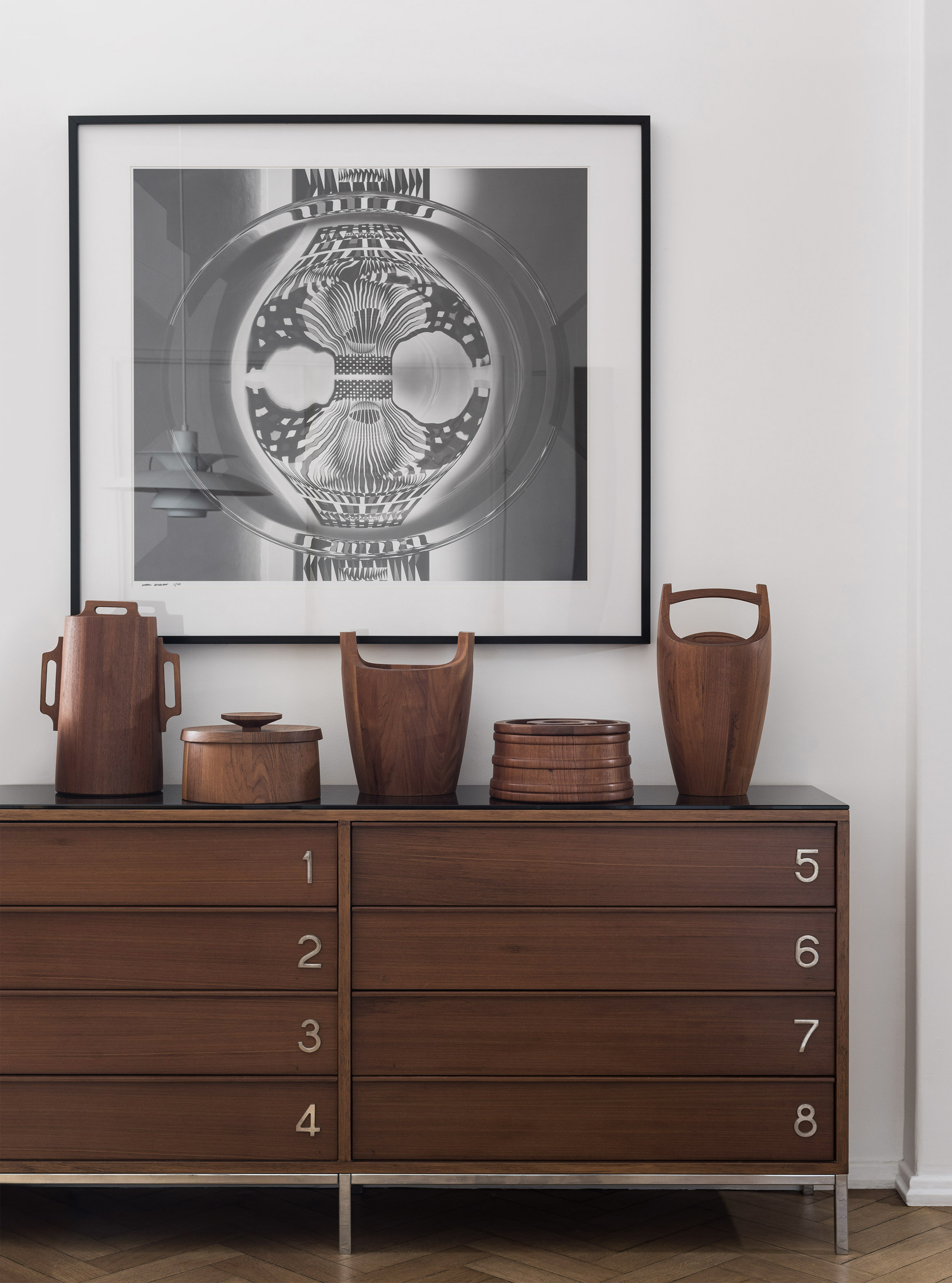
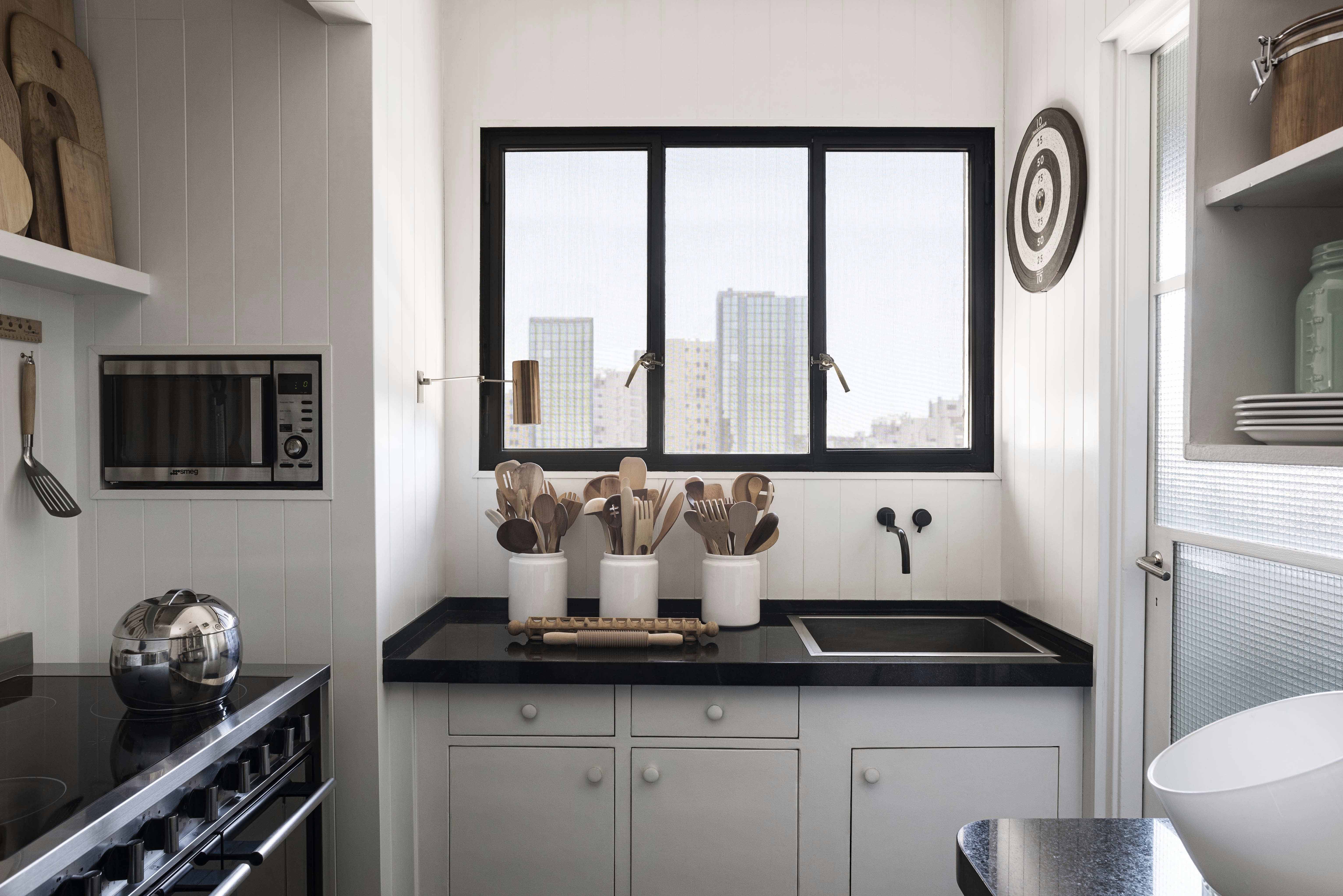
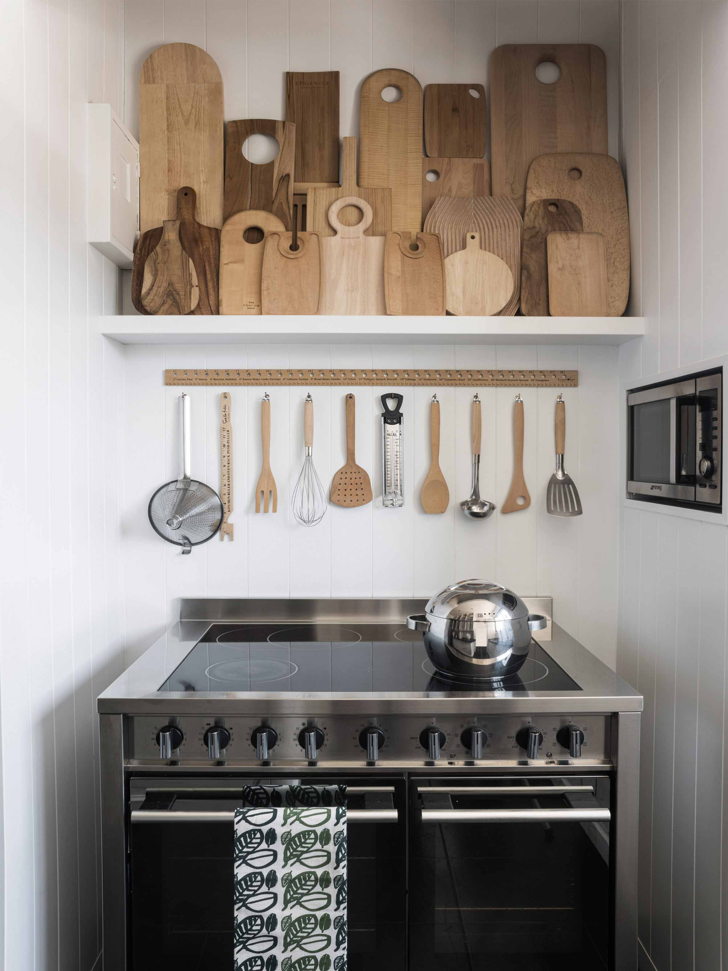
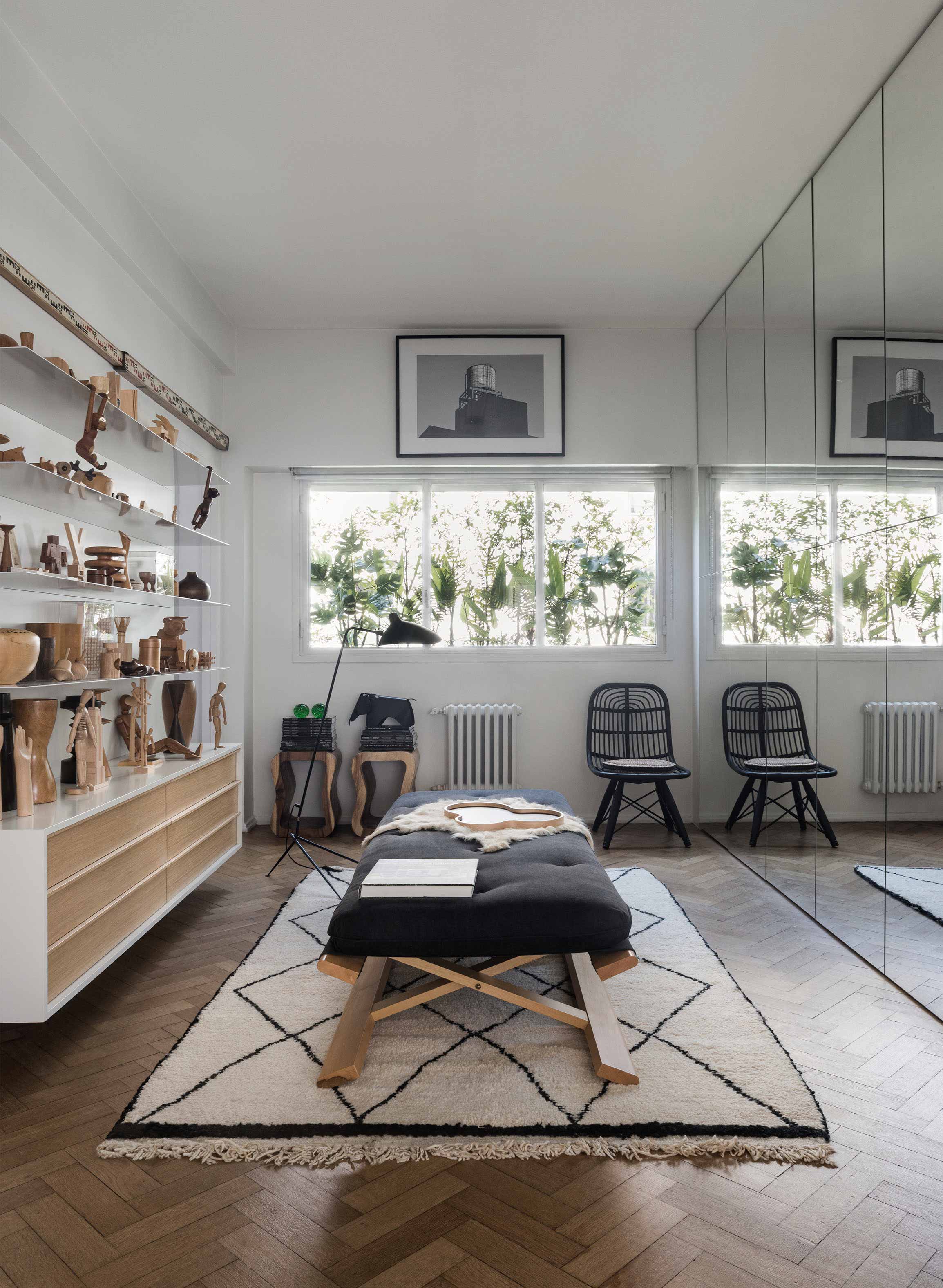
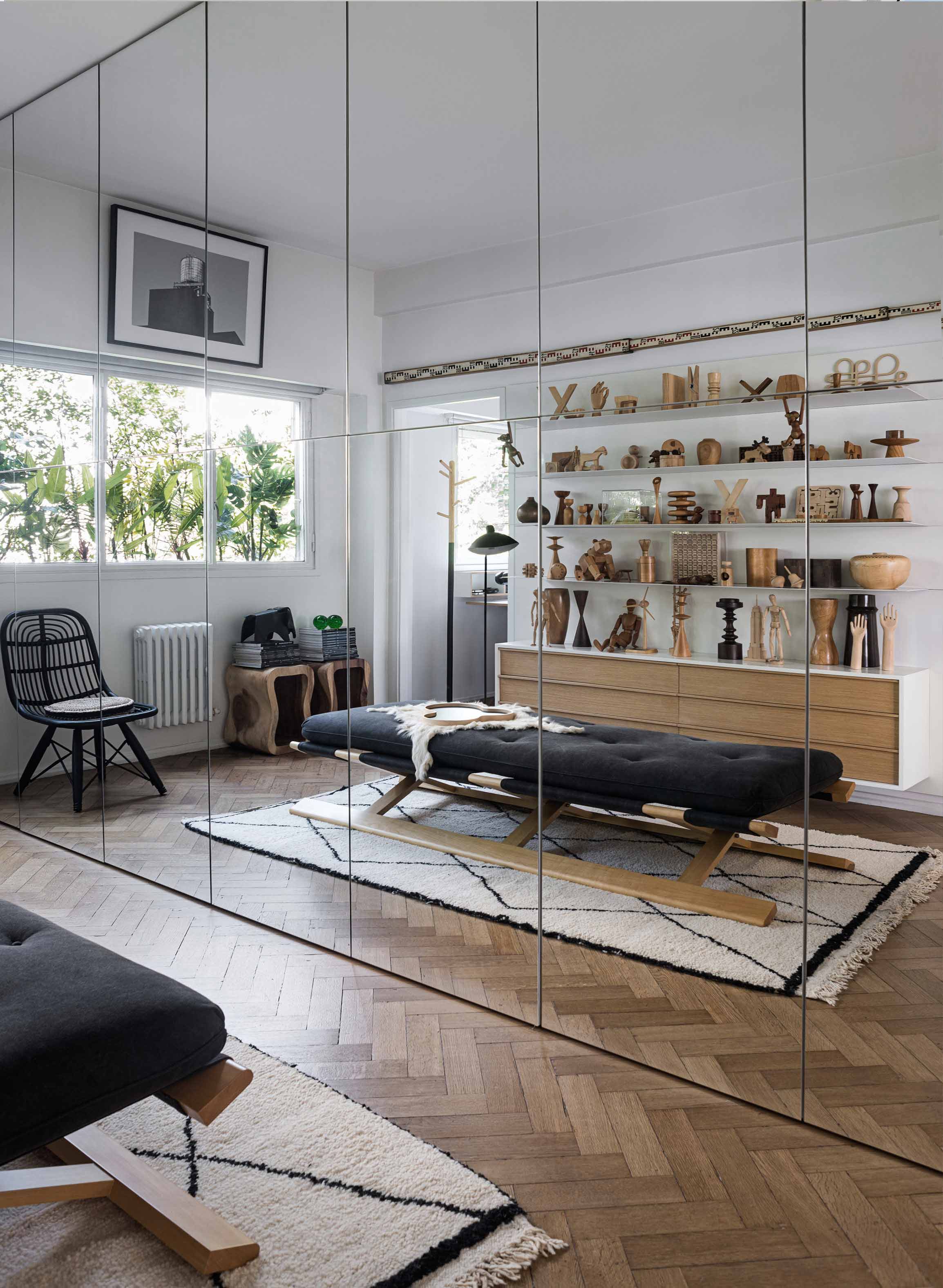
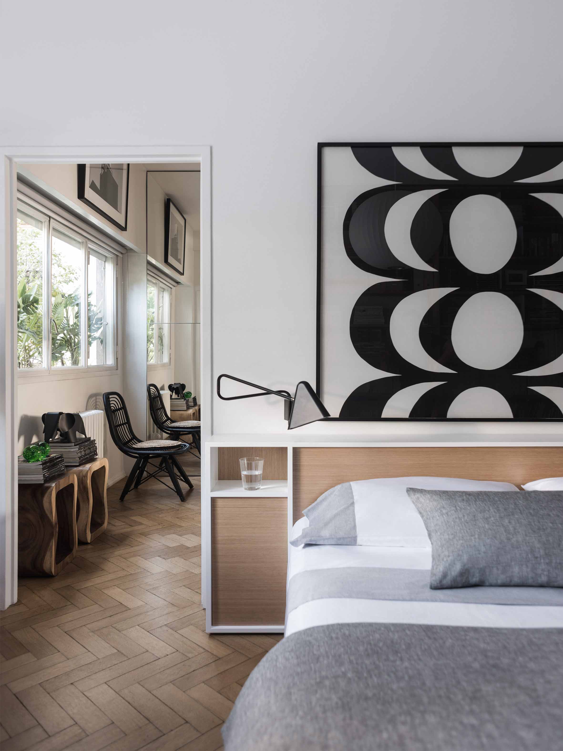
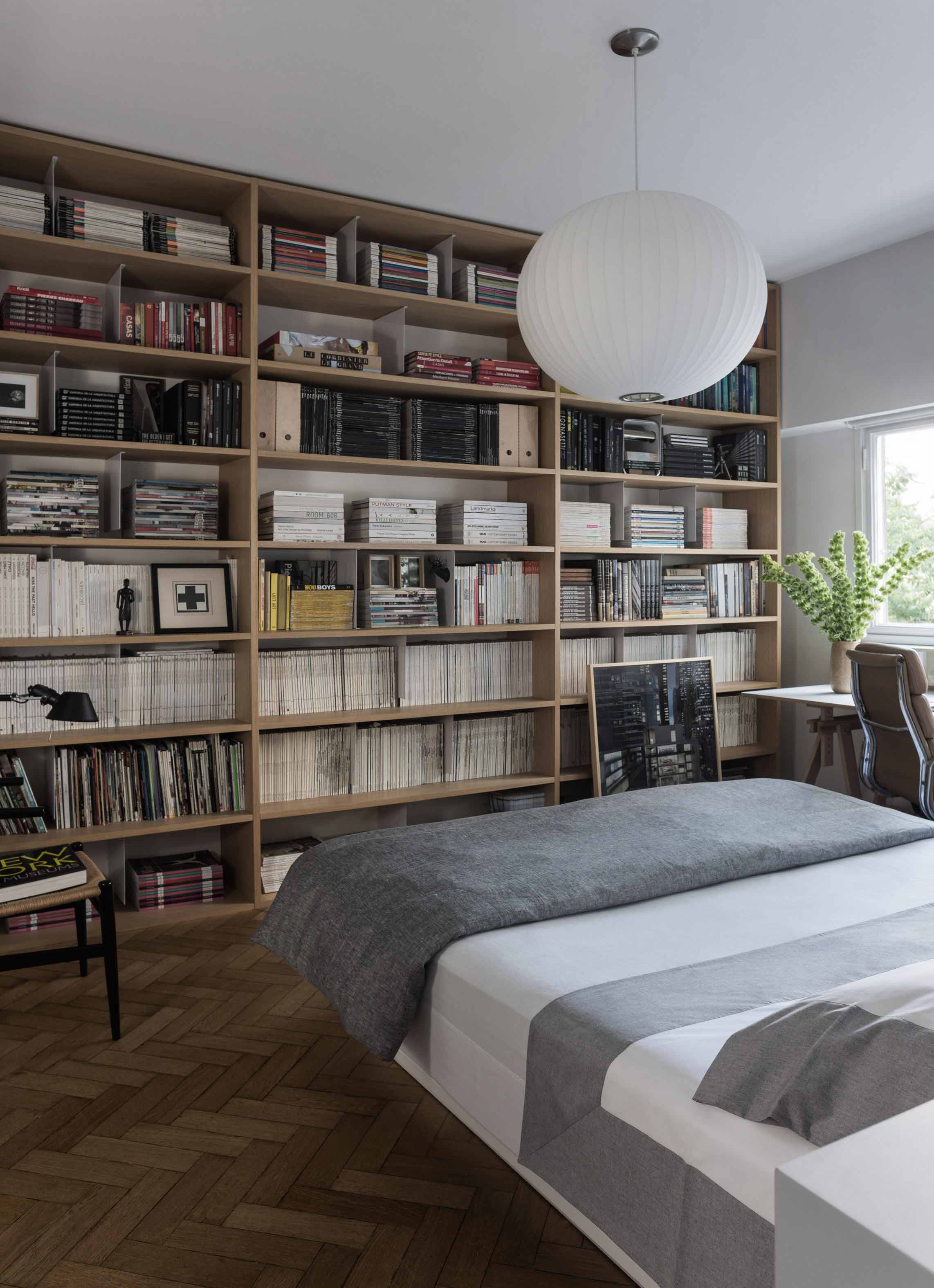
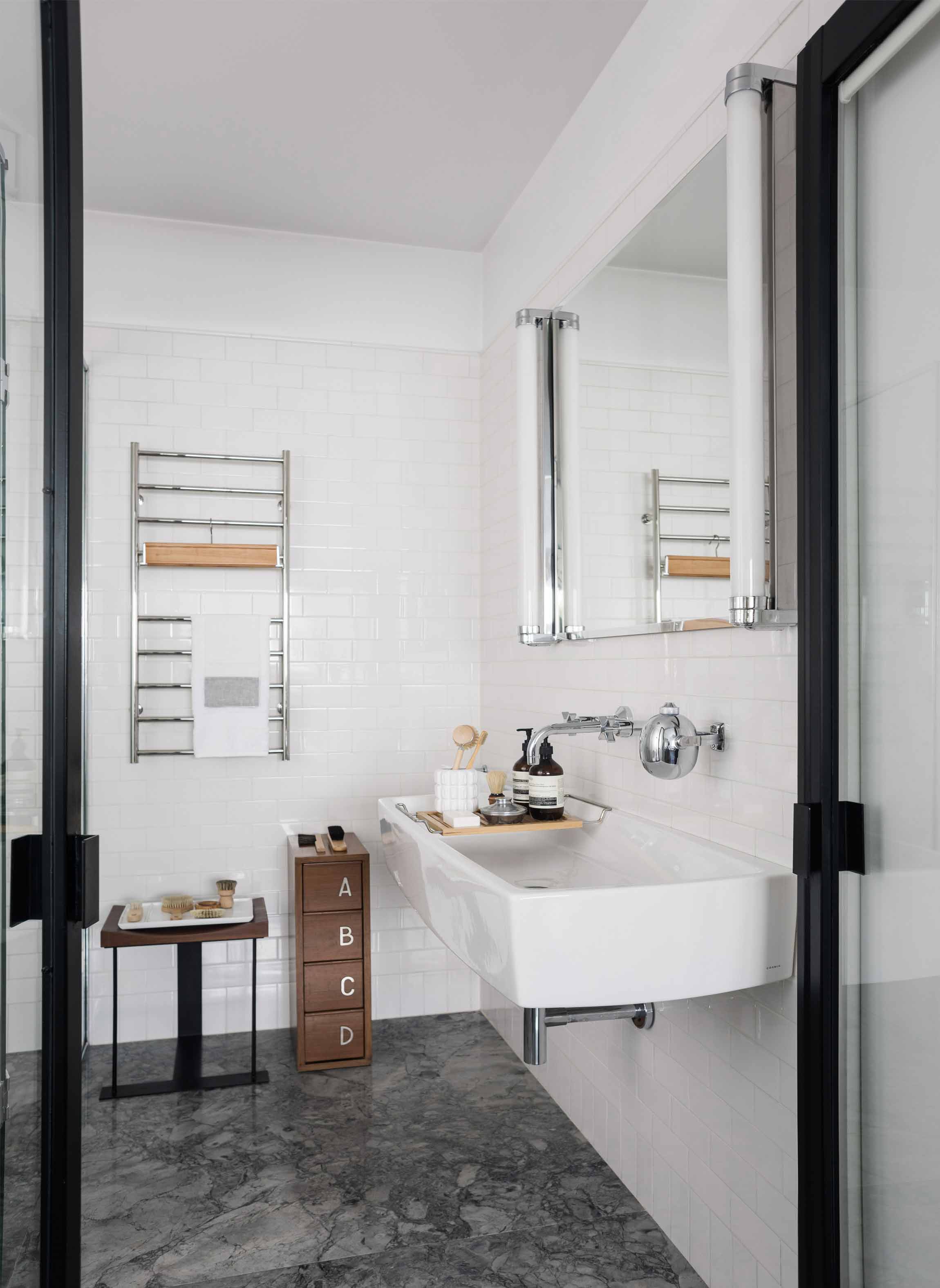
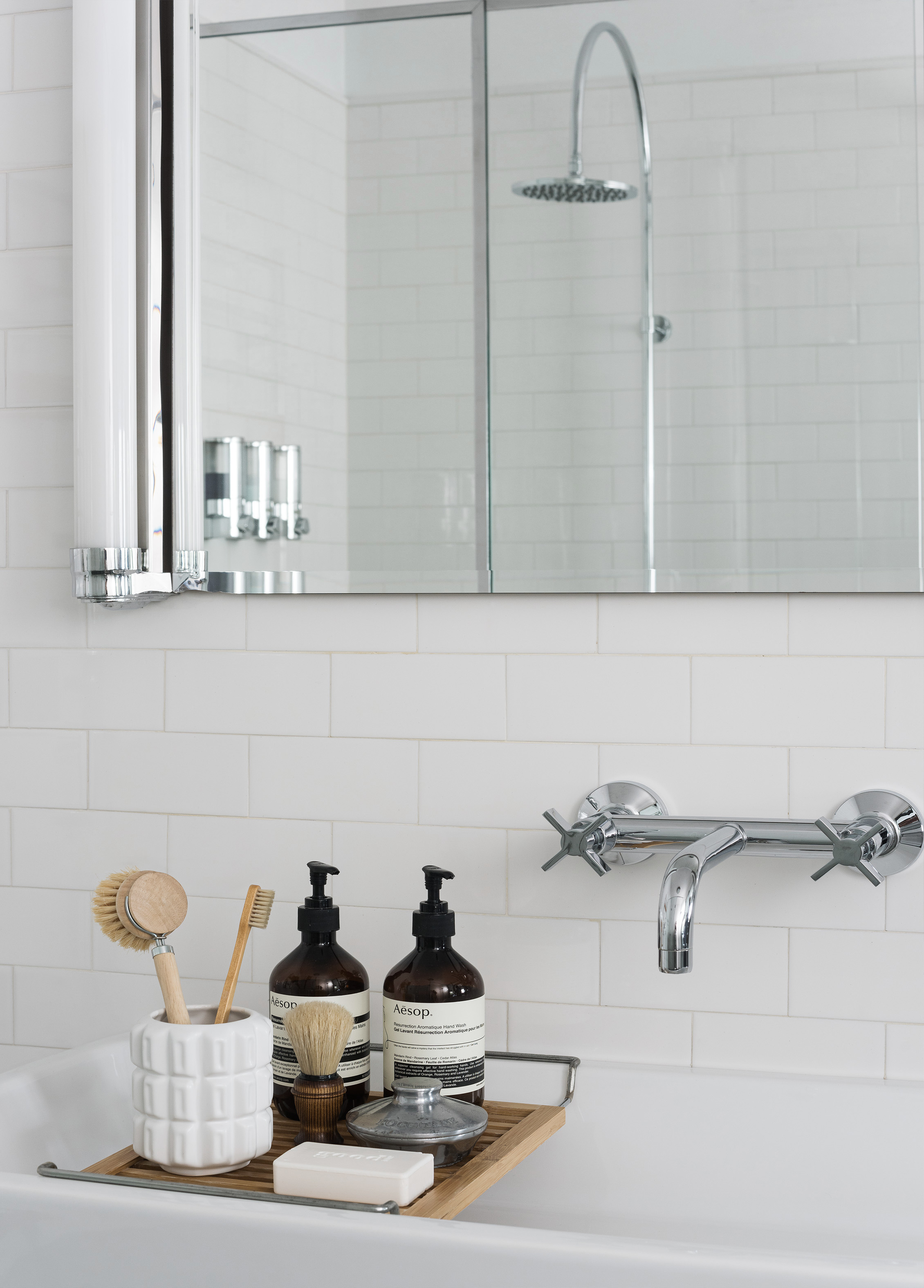
The apartment is located in a building with a twin construction: they both share the same façade and are a clear exponent of the rationalist architecture that was prevalent in Buenos Aires in the 50’s and which is quite typical of the Retiro neighborhood in particular. These origins were taken into account for the renewal of the apartment. The owner was particularly drawn to the layout of this apartment since it offered an unusual, free-flowing visual continuity. Indeed, this unit is part of an open layout with few obstructions and offers attractive views both at the front and in the back. This sense of continuity, enhanced by the uniformity of the Slavonian oak floors, was absolutely respected and actually reinforced. The original openings were restored for conservation. A careful interior design plan was carried out with custom equipment for each room that would also hold the owner’s object and art collections. Furniture, lamps and different components from prestigious houses such as Louis Poulsen, Jean Prouvé, Arne Jacobsen, Serge Mouille, Eero Saarinen, Charles Eames, Achille Castiglioni, Vico Magistretti and Hans Wegner took their places in the home. As well as the works of Pablo Siquier, photography by Claude Azoulay and two spectacular acrylic pieces by Rogelio Polesello: one placed in a strategic spot to provide a virtual separation between the living room and the dining room, whereas the other piece welcomes guests arriving at the reception hall. To honor certain parts of a specific piece of art, some walls were painted black. Striving to enhance the free flow between all spaces was key when choosing furniture which had to guarantee that moving around them would be a breeze. Two openings connect the master suite to another space which combines both a dressing room -with mirrored doors- with a reading and relaxation spot. All bathrooms were integrally redone with materials and accessories that flow with the style of the original construction. The kitchen was made newly functional by keeping the original furniture while adapting everything to new uses, white coverings were added to the walls made of vertical wood panels. Brand new flooring, faucets and kitchen counter were installed. In spite of these innovations and the tidy look they provide, there is a predominantly traditional feeling in the kitchen thanks to the old fashioned furniture which leave plates, glasses, and a series of elements in full view. Just like in all rooms in this apartment, good design is ever present.


