interior design: Estudio Muradas
ph: Daniela Mac Adden
digital retoucher: Silvia Cardozo
texts: Sol Dellepiane
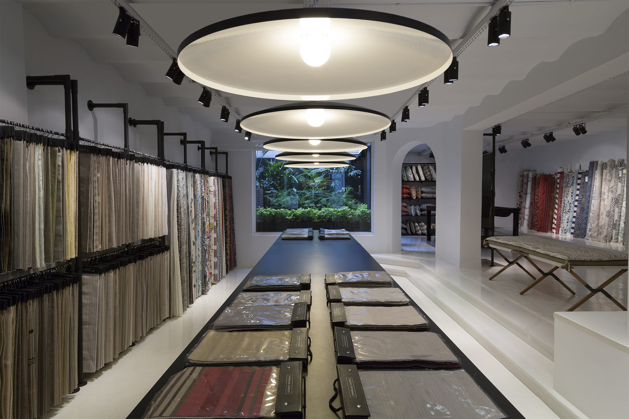
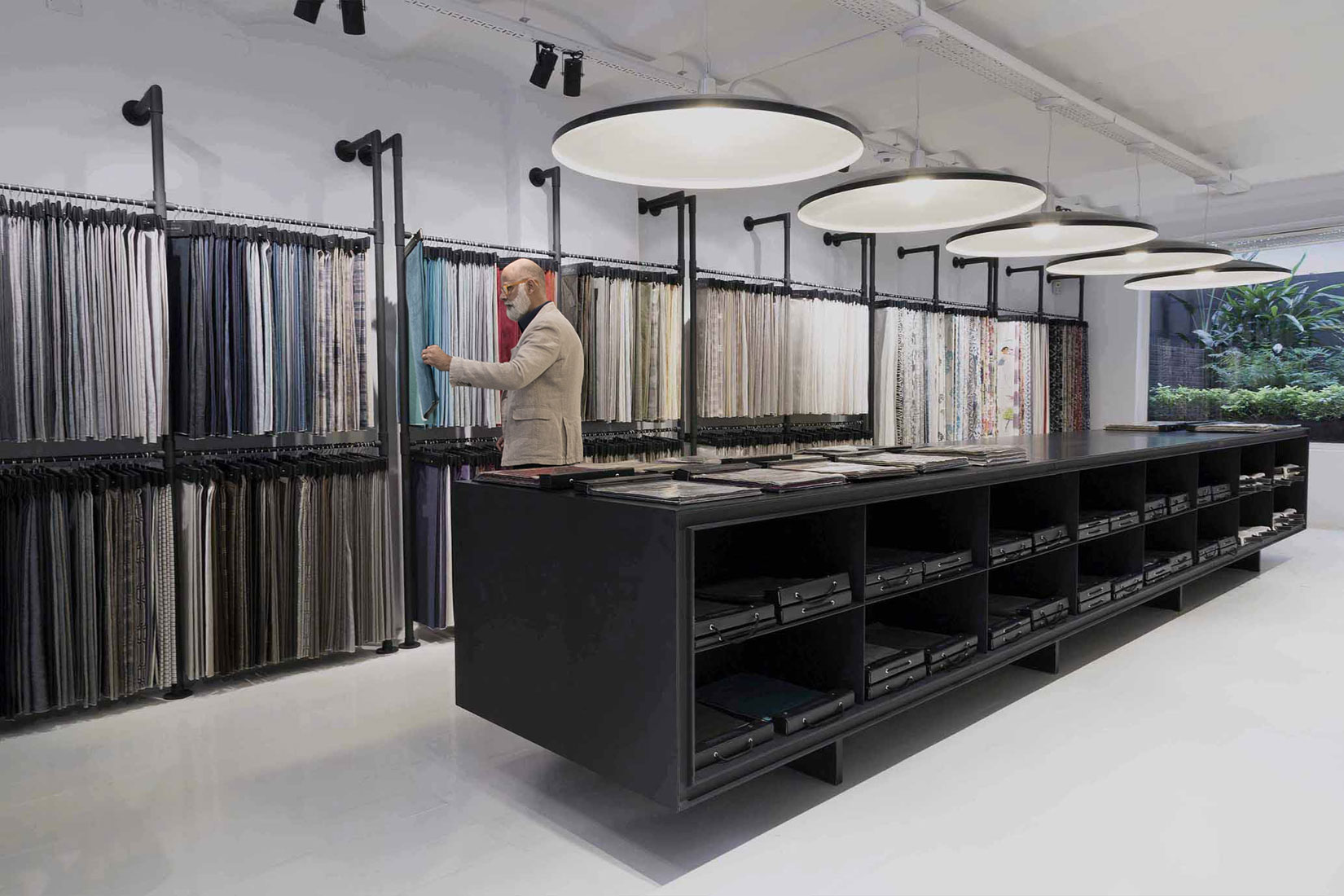
For stores of this distinguished company that sells fabrics for decoration, the Studio worked within certain rules that would later adapt to the specific characteristics of each site. The thread tying everything together here is a white box with black painted ironwork, flexible, configurable modules that exhibit the product, a contemporary vibe, and vintage details as a testimony to the history of the firm. Read more
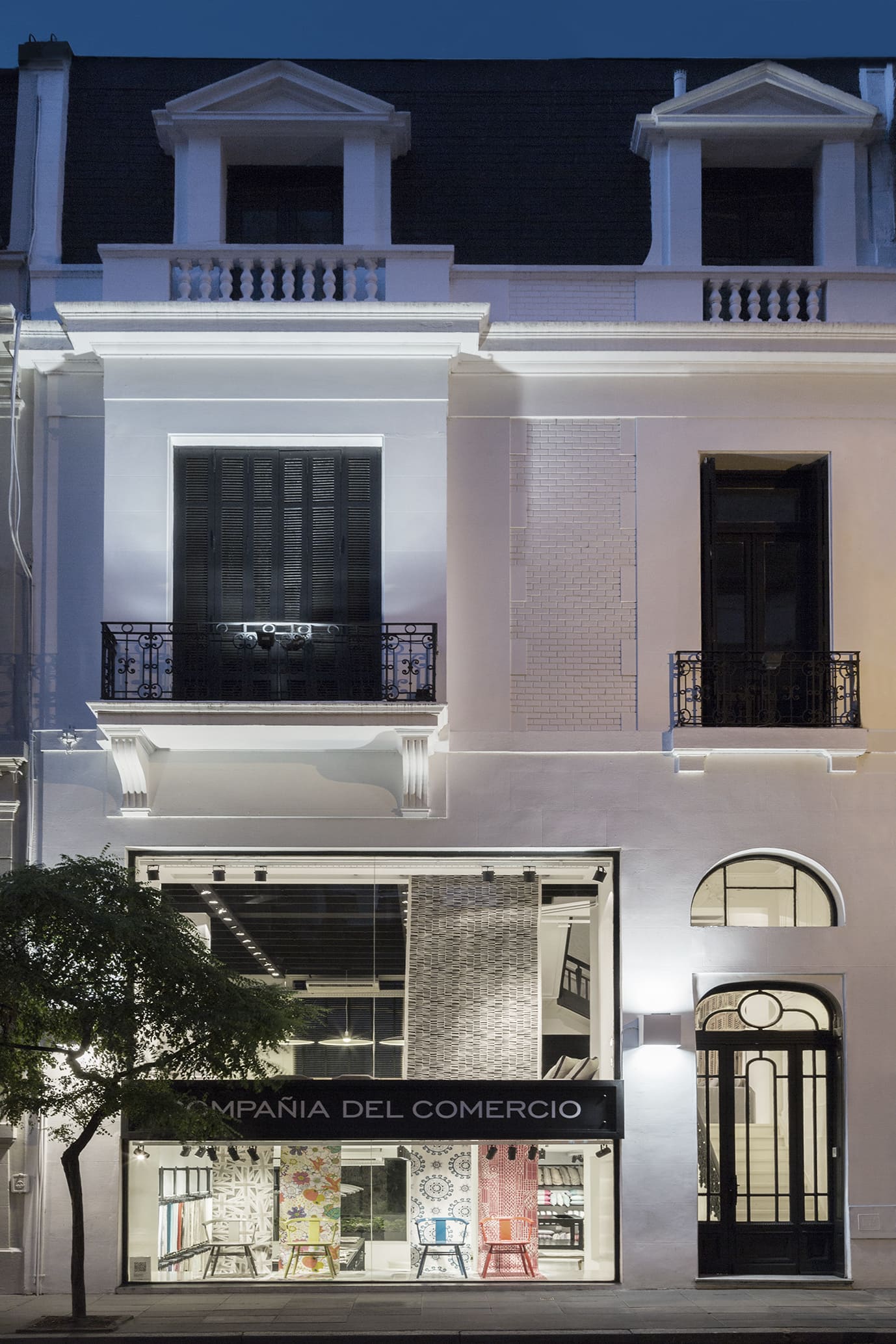
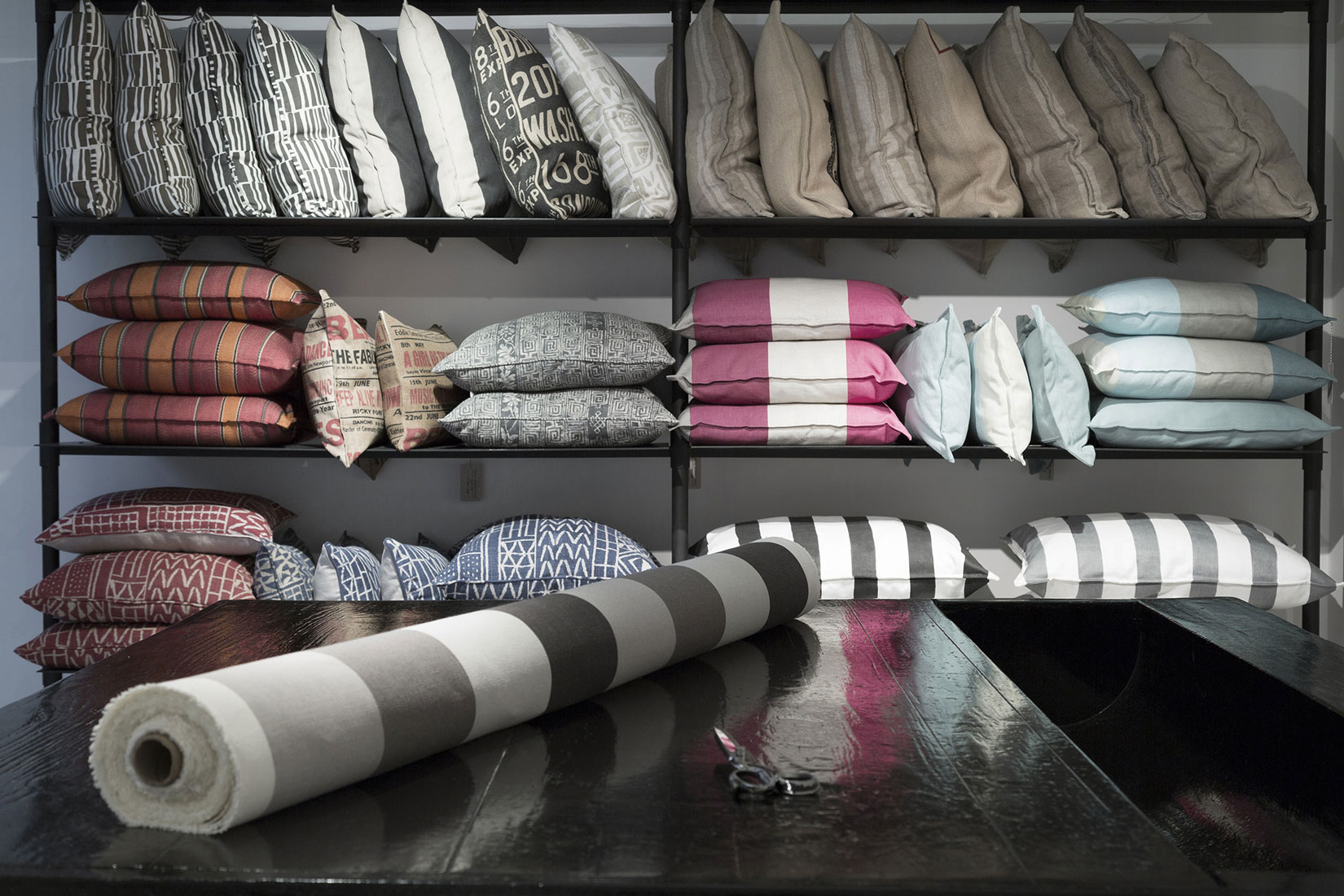
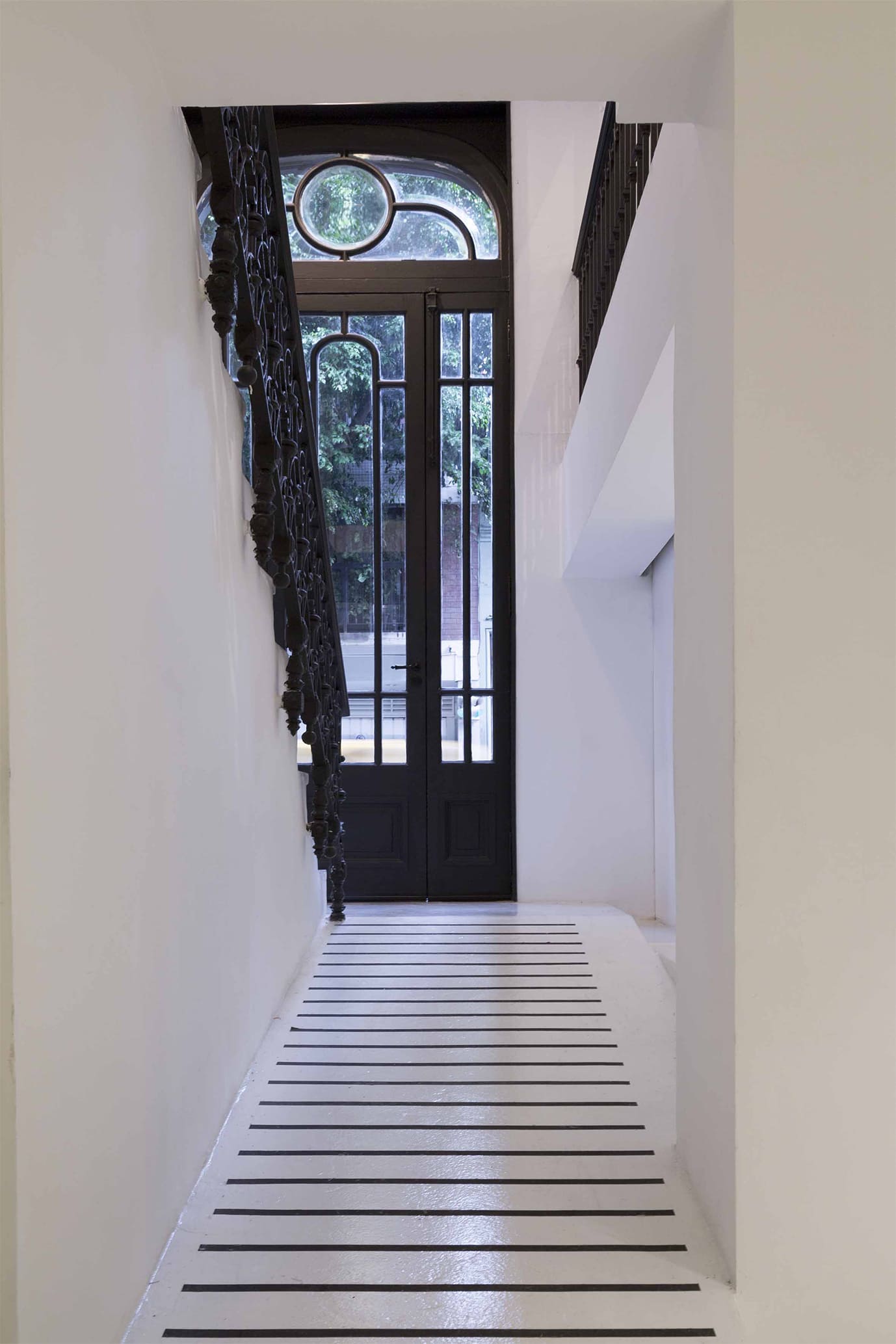
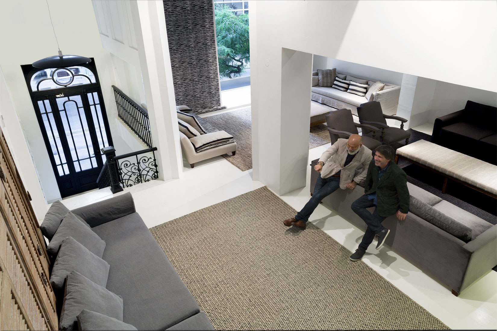
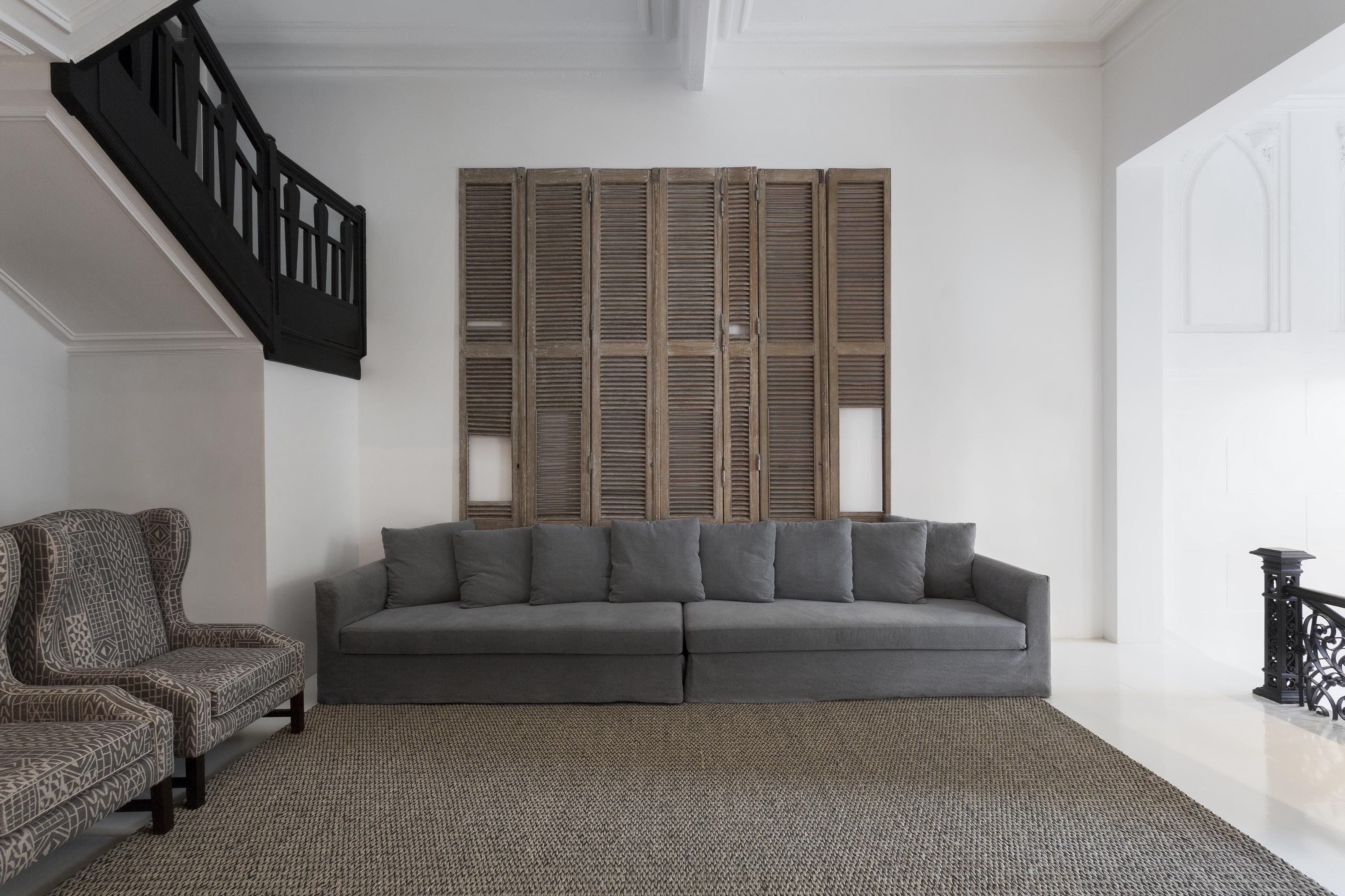
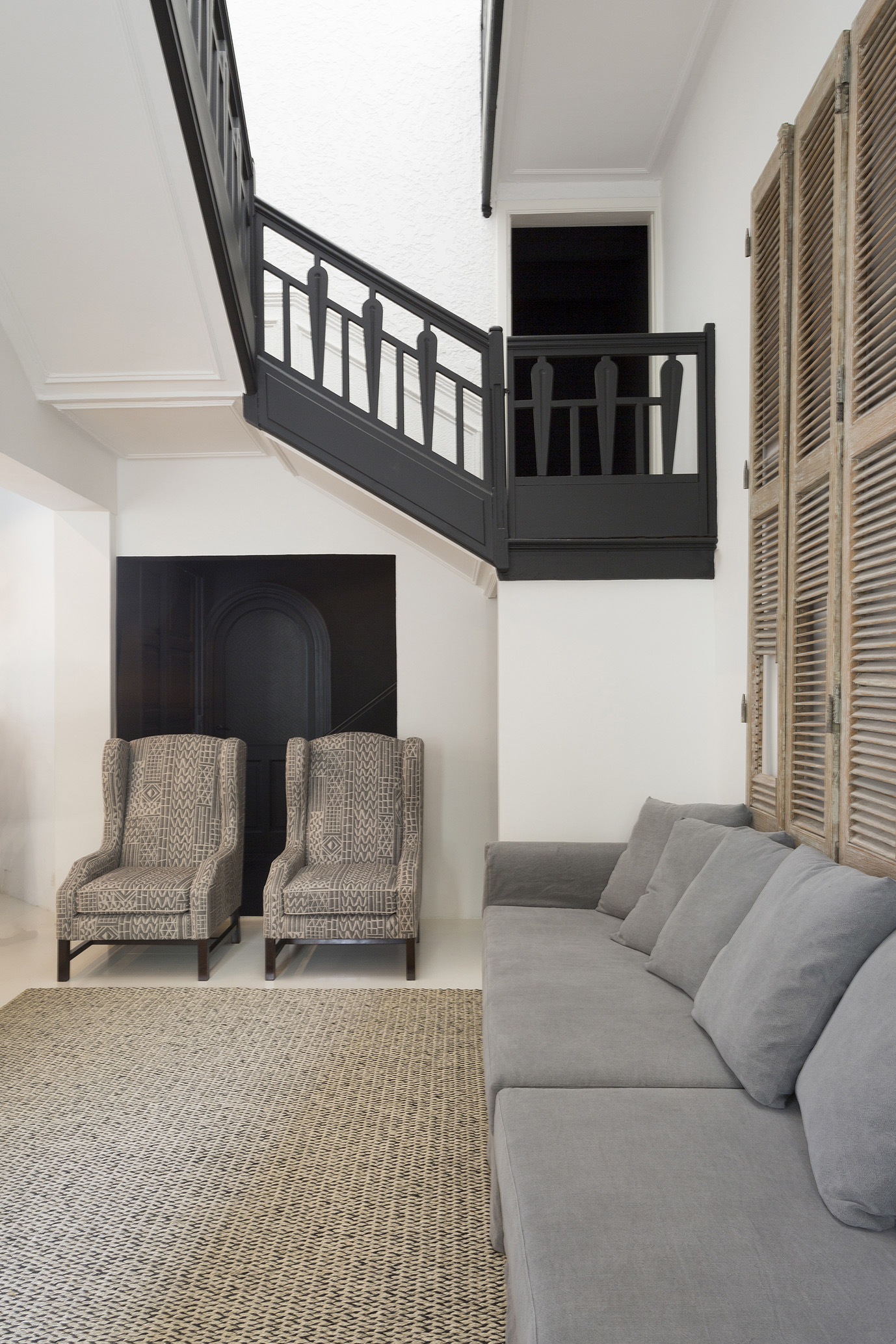
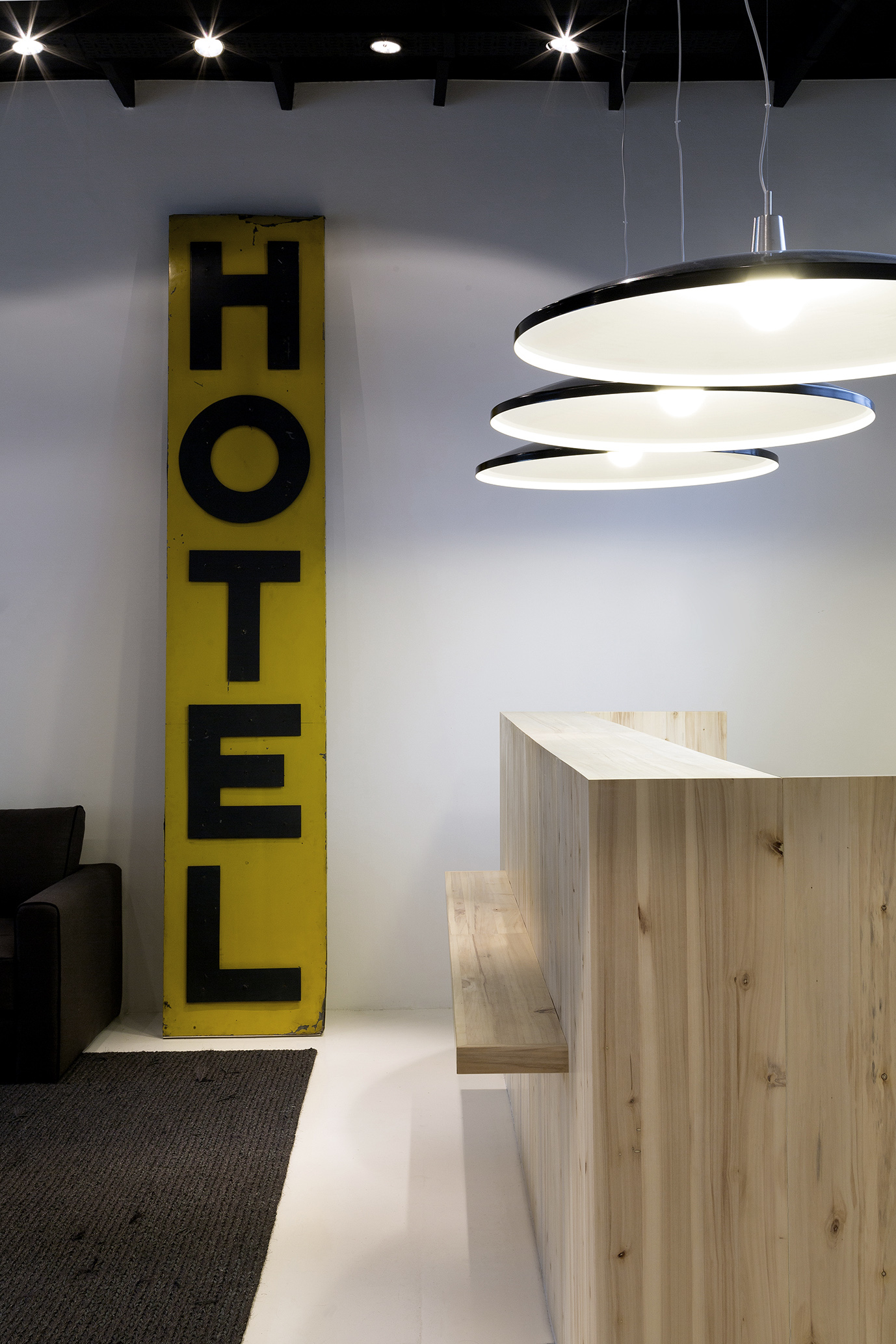
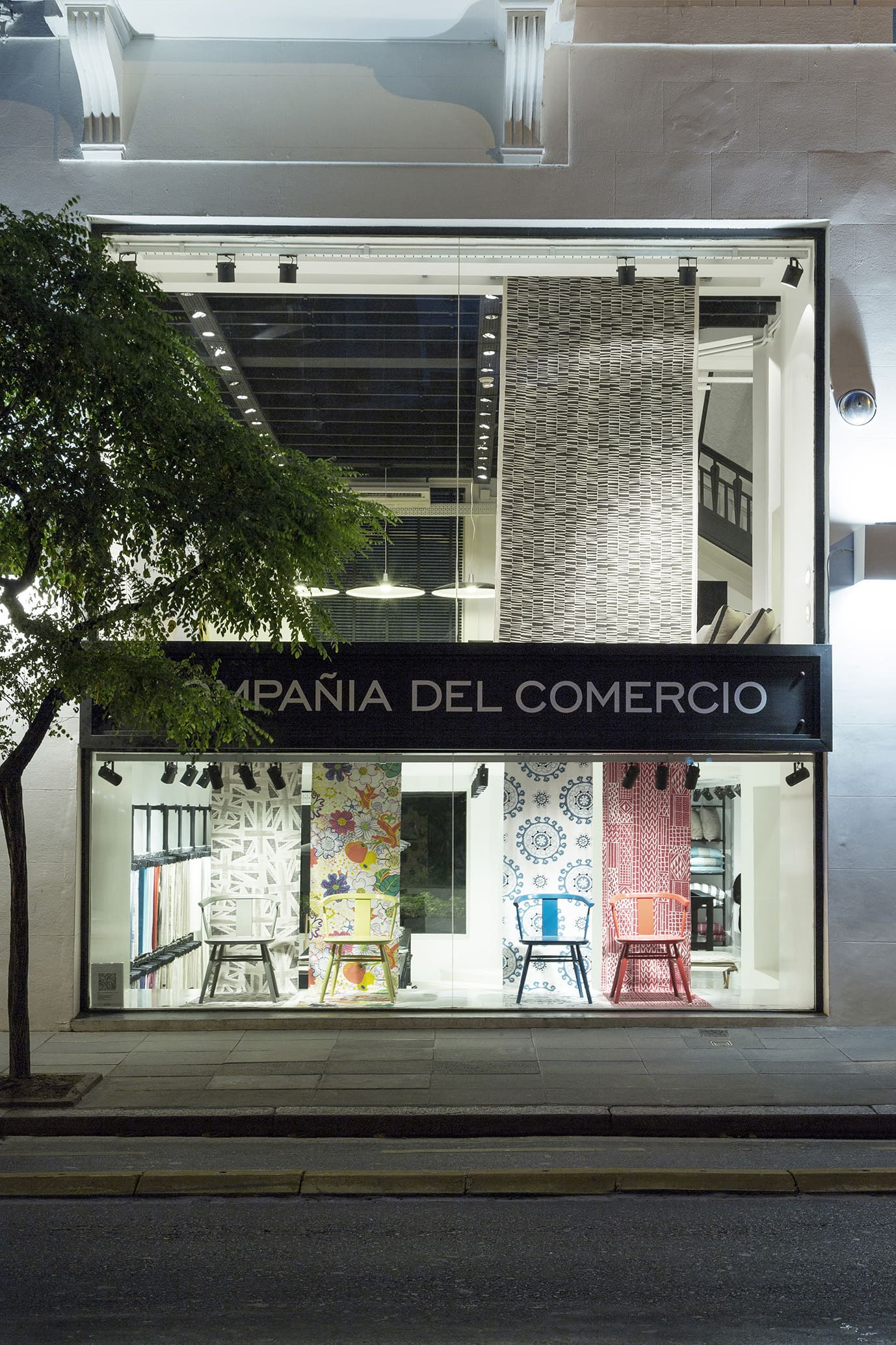
The store is located in a house built in the early XXth century on a city street which is iconic for interior design. For the box to be completely white and neutral even the wood floor was painted white. As is the case with many firms in London, the basement, which has a very low ceiling, can be accessed from the entrance. Consequently, with white being ubiquitous, the store is transformed into a more spacious and friendly space. For textiles, a product so tied to fashion and trends, a way to showcase them with maneuverability had to be found. The particular system created by the Studio, together with its clients, in order to display fabrics and paper is worthy of mention. It consists of configurable modules made out of iron that can be used as clothes racks, as panels (used for the decorative paper) or as shelves. As a counterpoint to the very classic house, the equipment is contemporary. In the back, a patio with tropical vegetation lets the natural light in and provides the whole ambience with freshness. A stairway leads up to the top floors, with very high ceilings and wooden beams that were painted black, given the generous height. As for the top floor, the intention for future use of the rooms is miscellaneous, using them as space for shows and holding conferences covering topics on design. All original carpentry in the house has been conserved. Another decision made was to leave pipes and other components in view, instead of hiding them, as is usually the case, with the intention of generating a pleasing visual effect. The historic tradition of the brand is expressed in some antique pieces such as a carriage, some presses and a table.


