interior design: Estudio Muradas
ph: Daniela Mac Adden
digital retoucher: Silvia Cardozo
texts: Sol Dellepiane
The redistribution of a very spacious apartment achieved an overall integration and a smooth continuity of all rooms; crucial skills of the trade were at play here and they included previously knowing the client. Read more
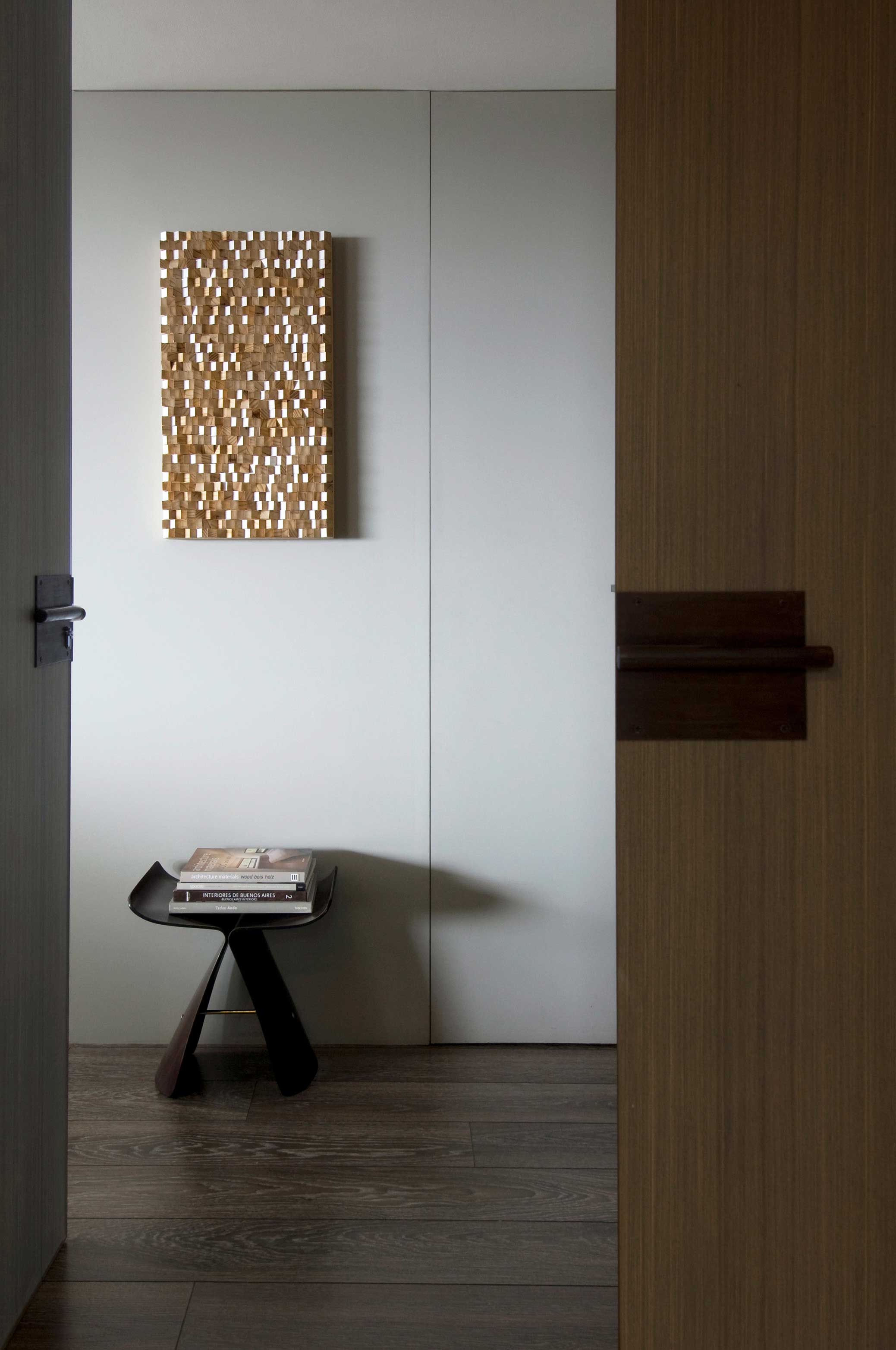
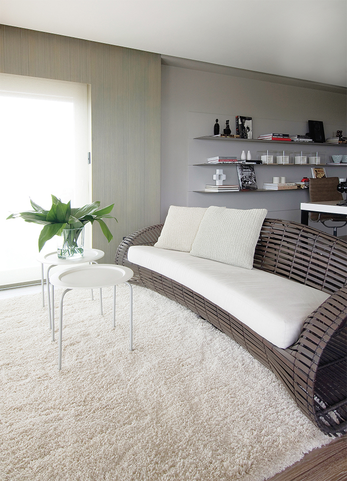
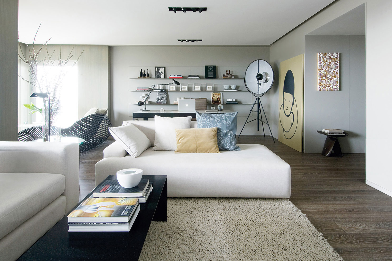
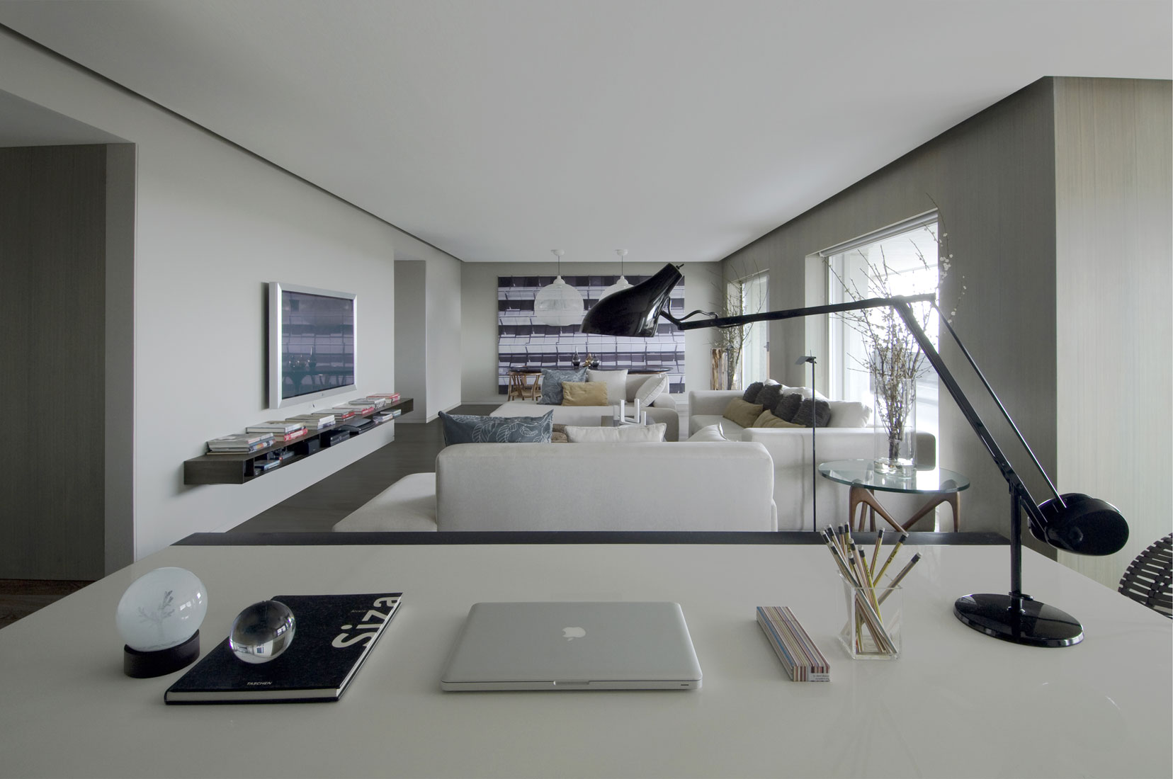
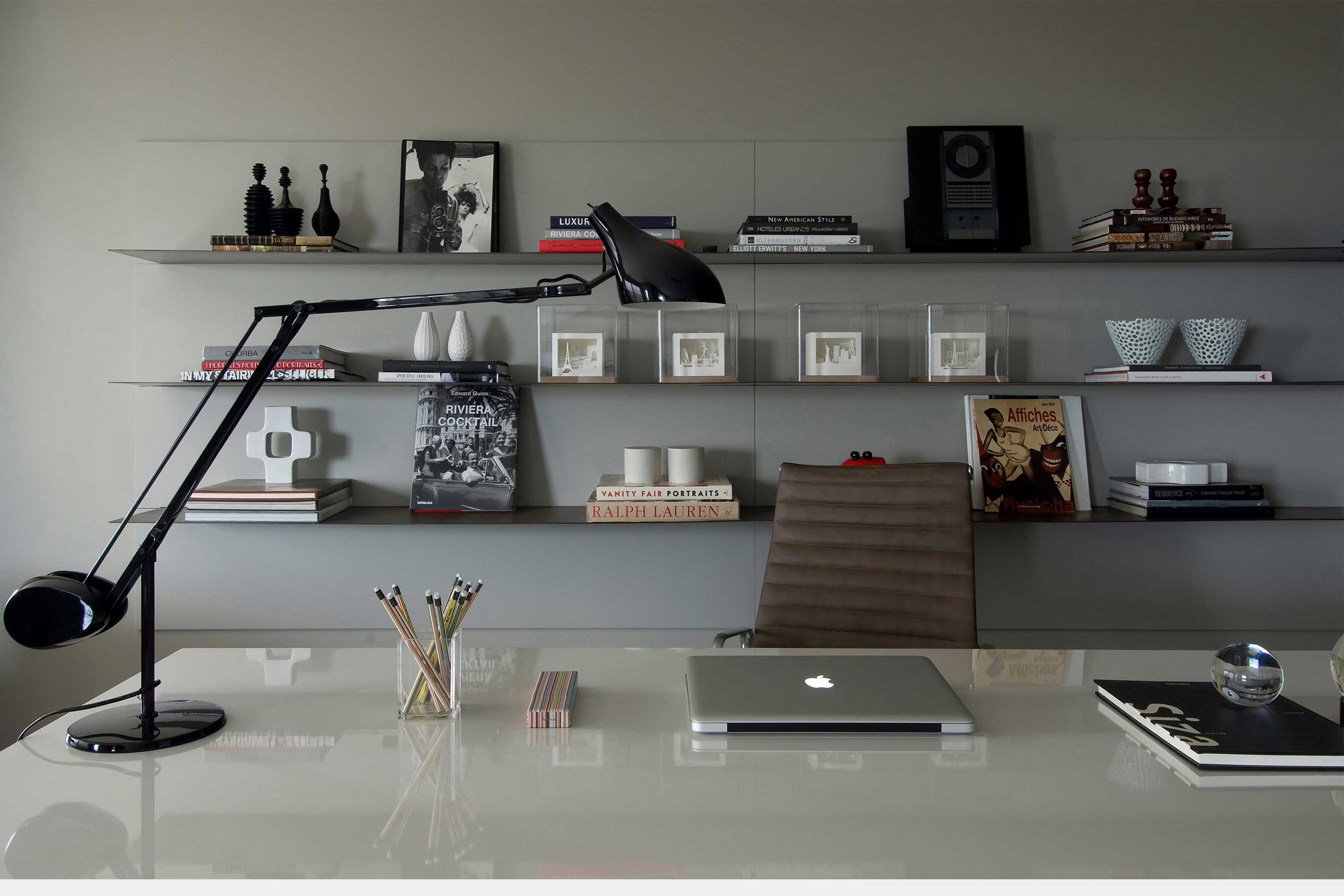
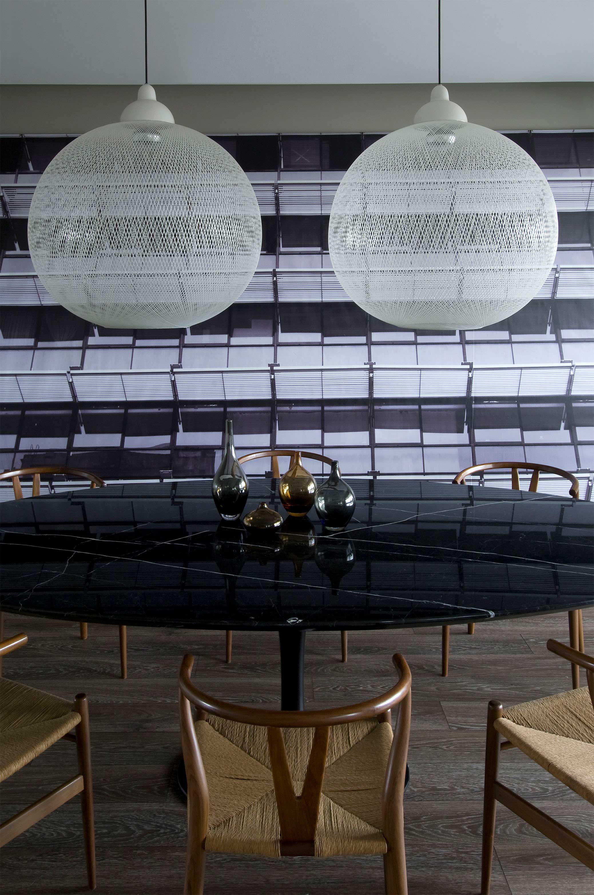
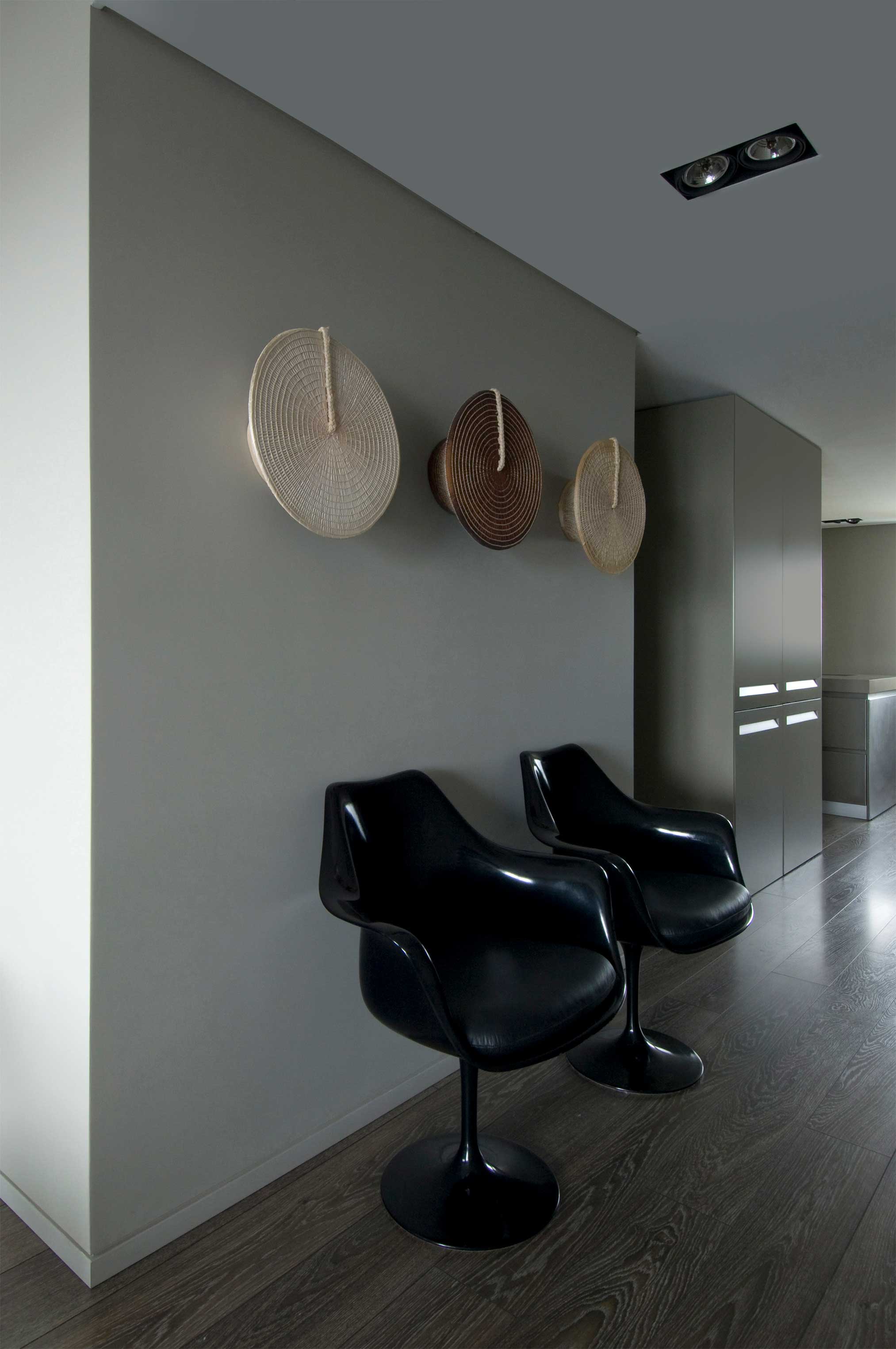
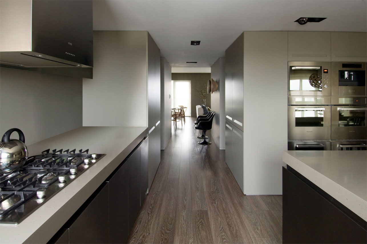
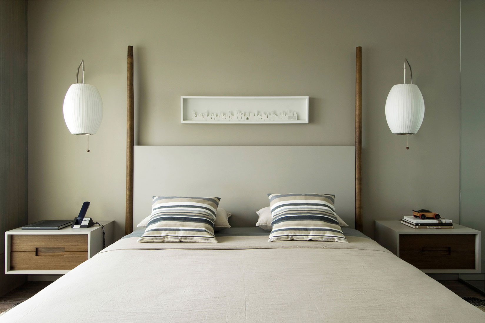
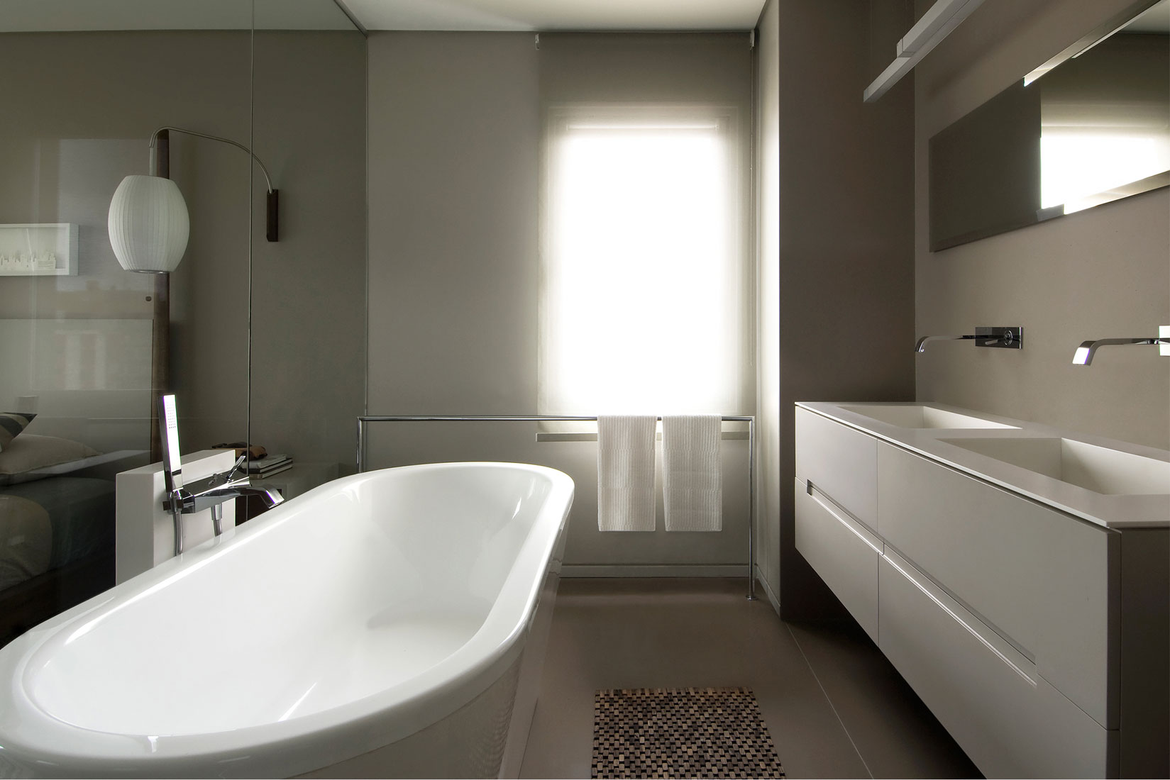
Basically, the commissioner gave the Studio carte blanche to do what it considered best. So the first step was to reconvert the layout, which was too compartmentalized, into a more open and continuous space. Taking the client’s wishes into account, out of the three rooms that made up the social area in the apartment, a great single space was created instead. Additionally, the ceiling under the beams was unified and given special lighting by resorting to throats throughout the perimeter. The old windows were replaced by huge glass panes. The wood coverings used were the same color as the walls, similar to a portico to hold the curtains. Doors were eliminated, leaving only those considered strictly necessary, so that even the kitchen is visually integrated into the dining room area. Consequently, a more free flowing circulation was obtained. In the private sector, several rooms were converted into a grand master suite with an integrated bathroom and dressing room. As a trademark of the Studio’s renovations, the complete flooring in the apartment was unified, including the one in the kitchen. This section took on particularly ample dimensions since the kitchen now encompasses what had previously been an important service area. The walls and boxes which contain openings, were painted gray, a color which tends towards the same hue as cement. This tone can be found decorating the whole apartment, matching the public area with the master bedroom where gray is even replicated on the bed headrest. Gray is present in the kitchen and bathrooms, and can also be discovered in the Corian in a similar tone. A true blending of materials and textures has been attained through the art of color: plaster, wood and synthetics from the most efficient technologies fused within the same color scheme successfully create a homogeneous effect that is both coherent and elegant. The owner’s habits were key when putting this project together. A single man living alone with an intense social life, who loves both movies and music. He often works here so his study was designed down to the last detail to offer the perfect home office.


